Celeste is finally up
I like her a lot tbh
Her plots are ok
But she’s so slay
3 Likes
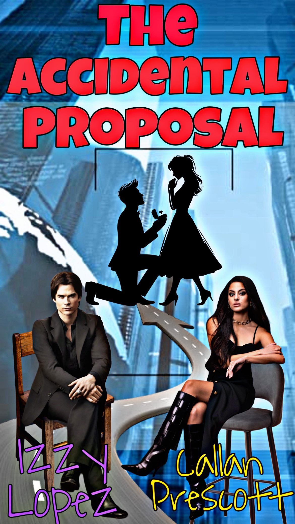
I loveeee how the names are criss-crossed
I think your only area of improvement is just making your letters a bit quieter
So like
Probably the same color maybe red or black/white
And then like formal fonts
5 Likes
The colour scheme could be a bit more cohesive and less saturated (there’s a bit too much going on colour-wise)
Also, like Ixy said, choosing a more formal/mature font
I would look at other film posters from that genre and see what type of fonts they use but generally, if you’re going for a more modern look, use a sans-serif font (ie arial), and for a more formal, elegant look, use a serif font like times new roman
Both of the fonts you’ve used right now are considered display fonts and it’s usually not advisable to use more than one
4 Likes
If I send in some examples of fonts would yall tell me which is better?
3 Likes
Sure
3 Likes


I would say use either 1 or 3 as your title font and then choose a sans-serif font as the secondary font for the names and stuff
6 Likes
Just out of curiosity- what program are you using to make these
4 Likes
Lol there isn’t a time limit, my guy started being an actor like a month before moving to Beverly (but he was a soccer star before that so …)
1 Like
I didn’t see that, are you planning to post that becuase I would love it!
1 Like
It’s a website called font space
4 Likes
<fontspace3
2 Likes
There is a 3
2 Likes
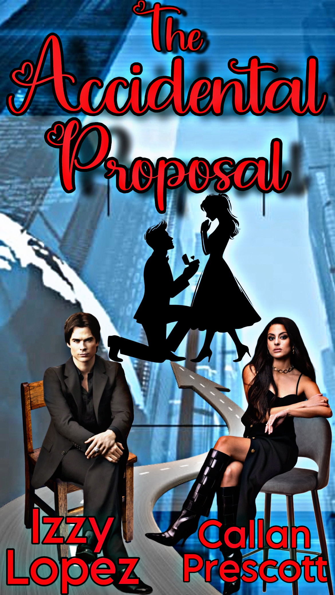
Looks nice, how did the one I made work out?
2 Likes
Not finished yet. Haha
2 Likes
loveee them but Eva is not there ![]() lol
lol
6 Likes
eva has also not plotted with me i think ![]()
4 Likes
Omg you’re here! Can’t wait to RP with Eva and Dave!
2 Likes