Yes
Yes! ![]()
![]()
Of course
It’s cute
That was the intent. Should I change anything?
It’s a little hard to read the name, but I can definitely tell what it says ![]()
That’s what I was wondering about. Lighter or darker?
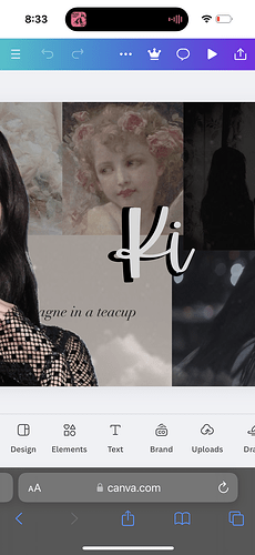
Honestly, just adding a black drop shadow would help separate the words from the background
Or lowering the opacity on the background images
How do I do the shadow?
love it. I was gonna say Yes. lol but everyone else said it already. So I figured you put it.
looks awesome
Yep.
Well, the way I like to do it for my banners if duplicating the text and having the text in the back be darker, nudging it a little so you can see an “outline”
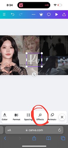
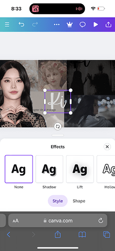
Otherwise here’s my photo demo of the other way ![]()
![]()
Oooh, I like this!
It feels very warm to me
It looks so good
Love the vibes
I wanted kind of a warm, coffee shop\fairy lights vibe.
That’s exactly the vibe it’s giving
Good, that’s what I was going for. Coffee shop acoustic guitar vibes.


