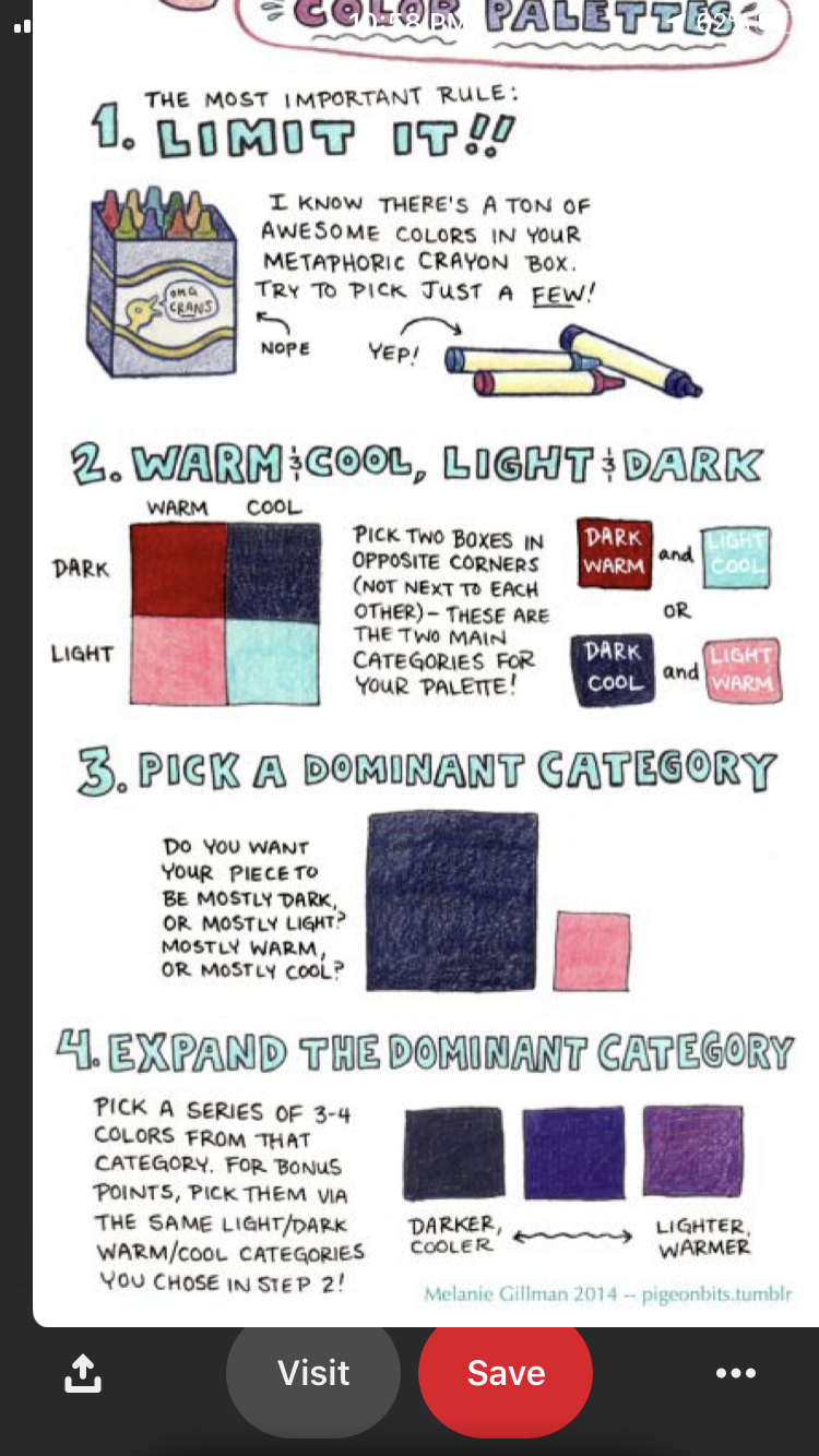
Time for a discussion about color schemes. Everyone knows there are some popular color schemes in art, black and white, green and blue, orange and yellow, grey and shades of purple and pink or different shades of the same color. For me when choosing a color color scheme in art I always base it on this article: https://www.google.com/amp/s/brightside.me/article/the-ultimate-color-combinations-cheat-sheet-92405/amp/
It has so much information, and just brings me to so many creative ideas when it comes to color. It gives a list of which colors work together well, as well as explaining how you can come up with an own color scheme based on the color circle.
If I don’t have any inspiration at all I sometimes use this generator that automatically shows color schemes you can edit completely until you are satisfied
On to some questions, also for you to hopefully really think about the subject.
How do you decide on color schemes?
Do you have any color schemes you regularly use in your art?
Do you particularly like any color combinations in general, but especially in seeing art?
Did you make any art in which the colors didn’t work well together?
Do you believe colors in art should always be complementary?
I honestly just pick whatever color scheme I think looks good… A lot of it is also using natural skin tones and such, because a lot of what I draw is just characters.
I don’t think so?
I really like teal and purple and I also like color palettes that remind me of forests, with deep greens, browns, and maybe some nice blues.
Sometimes, but I try not doing that.
No, for both senses of the word. Sometimes art is meant to clash and not to look harmonic. There are also tons of color schemes that aren’t complementary that look good.
Mood boards, photo references, colour palettes, etc.
Yeah, pastel schemes.
I love colour combinations with a great contrast, and maybe one or two supporting colours to help the main colour pop up. Like if you want red to be your focus, you can add some green to your drawing to make the red pop even more.
Without the knowledge of colour schemes, I used to play by ear. I just did what looks ok to me. However, after knowing a little knowledge of colour combinations, I struggle less when it comes to colour combinations.