…I’m just pretty big on shades and colors. My colorblind friends just roll their eyes at me and go about their merry way. I sometimes consult with them whenever I need more contrast in my work and can’t tell in the grey scale.
Yes, well, whenever they asked me for something done in color, it was a conversation and an half to find out whether they cared for a pale yellow or downright pink, because they just saw both colors as silvery (but if it was a guy, he’d be more particular about not using pink).
I kinda dislike it because… C’mon, let’s be real, have you ever used this emoji more than 3 times? (Unless you love complimenting people with oh my, you’re so creative or maybe you’re the creator
I like the WhatsApp emoji the most, it is realistic and has rad colors while still being simple enough to function well as an emoji. Some of those emojis have way too much detail, which just makes it more difficult what it’s supposed to be on a small scale.
My ranking
Rad: Whatsapp, Google
Pretty good: Apple, Samsung, Facebook, JoyPixels, Messenger
Decent: Microsoft, Twitter, Emojidex, Mozilla
Meh: Skype, OpenMoji, LG, HTC, Softbank
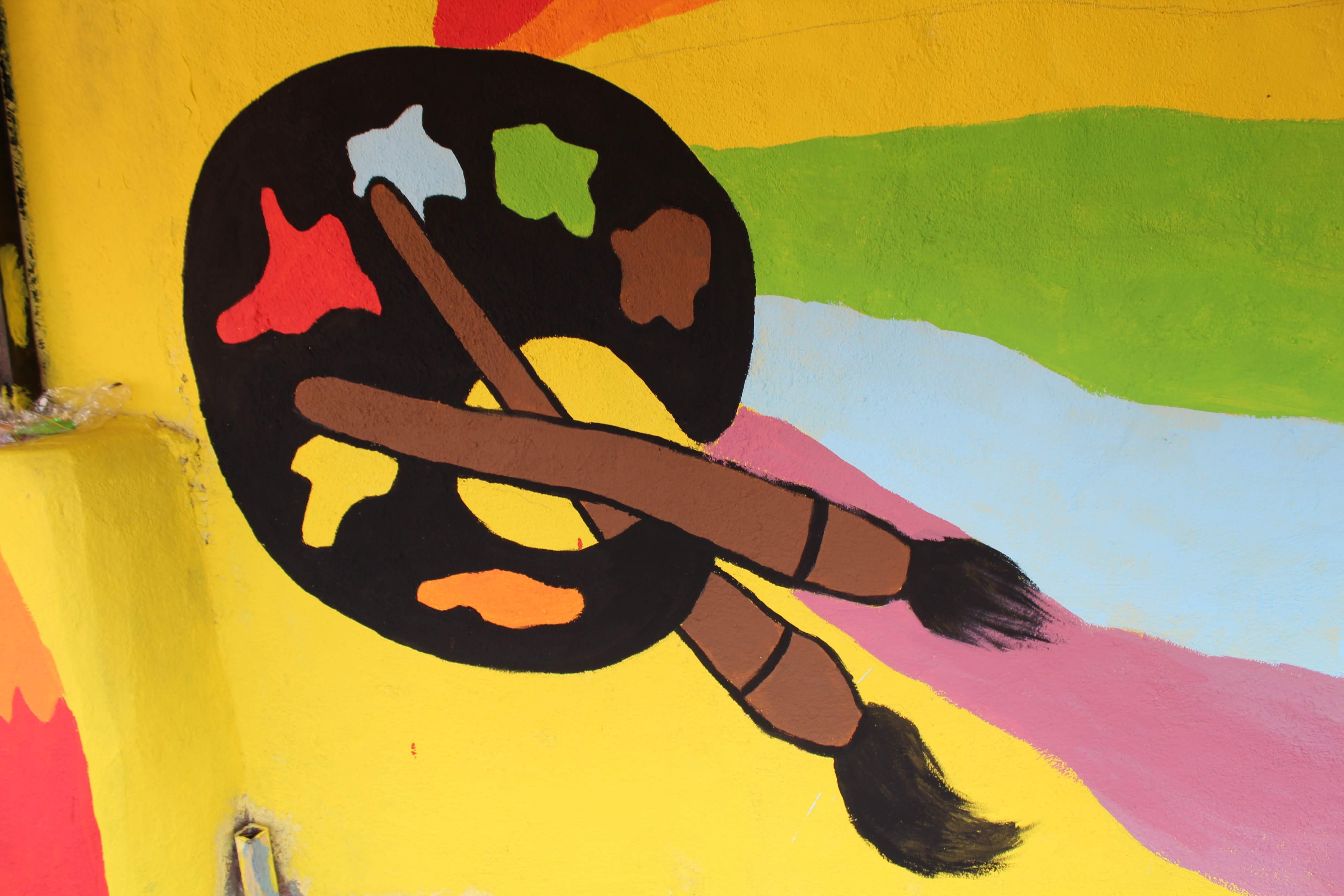
I don’t use it too often, but it’s a pretty cute emoji and I like it. Partially because it reminds me of what I painted on a primary school wall, bringing back awesome memories. Can’t find a picture of the finished painting, but this was the work in progress!
For me it’s the thick black line and in general the colours why I don’t really like it. That’s just a personal preference though, I can see why others would like it!


 emoji?