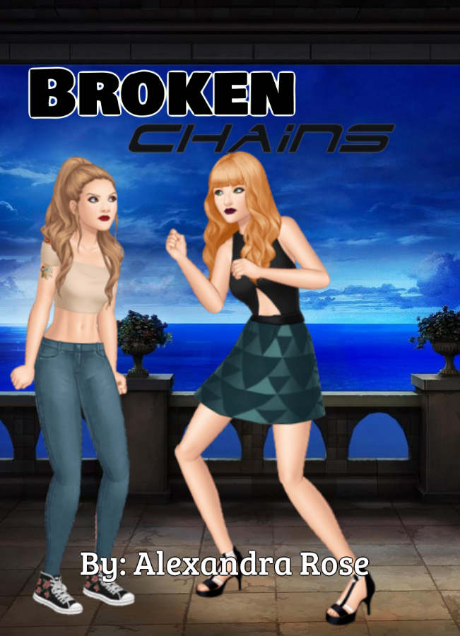
I’m looking for 100% HONEST and RAW opinions on this cover!
@/Artists
I like the cover but I would make it more centered. The right half is a bit narrower than the left half. The text is a bit hard to read. Except from that it looks good and high quality ![]()
I would maybe say choose a different background for the picture on the left- it looks kinda bland and i most likely wouldn’t click on it if i saw it on episode.
The text as @fraud said- is hard to read, maybe make it bigger and a different color?
Its still kinda hard to read the title- maybe place it in the middle? I would also make it white with a black outline- i think it would stand out more, but overall, the image just doesn’t stand out- maybe color correct it?
I’m NEW to this stuff. I can only use saved and background removed character screenshots ![]() That’s why I made this thread in the first place. To get opinions from people I can learn from.
That’s why I made this thread in the first place. To get opinions from people I can learn from.
Im sorry if my opinion wasn’t the one u were looking for! ![]()
I can help u out tho!
Really??
Yeah I can make an edit u want!
It looks kinda messy and boring, and it’s a bit hard to read the text. If i saw this in the app I wouldn’t click it, tbh.
To make it more interesting, you could get an edited or drawn cover, since it looks nicer and isn’t just characters doing animations, which is almost every other cover on the app. Look at popular story covers for inspiration. You also probably want to condense everything, there’s a lot of open space at the top right now since all the action is on the bottom and it makes it feel off-balance. That’s all I can think of right now.
I’m trying to do it on my own.
Well, maybe you could try to learn Episode editing (really not that hard, it’s basically just tracing) or if you’re an artist you can try and draw it.
For this new cover, it’s okay, but I found that to make it a bit better you could use a compositional rule called the rule of thirds. It’s a rule that says that the horizon and/or subject of the photo (since there are two subjects in each photo, it would be the middle of the two) shouldn’t be in the center of the photo. Here, I’ve split up the pictures into thirds, and drew the horizon and the middle of the girls in red.
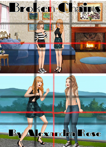
See how both the center and the horizon are nearly in the middle of the photo? It’s not visually appealing, and it makes the person looking at the cover stare at the center instead of being drawn to the subject. Here, I’ve made a rough fix (obviously it’s not perfect, I just used the image you gave) to make it fit the R.O.T. better.
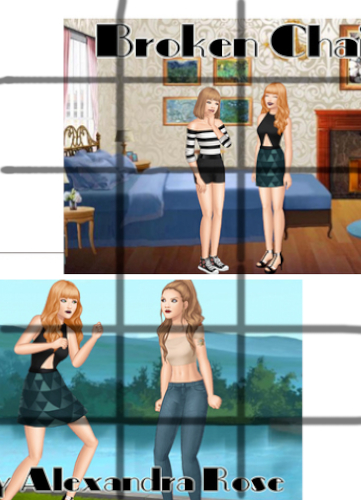
See how now the horizon and the center of the subjects match up with a line? Placing the subjects in opposite corners also makes the cover look more full.
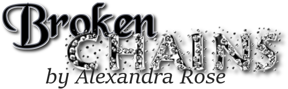
As for the title itself, right now it’s all the same size, color and font. Take a look at the episode’s featured page of stories:
See how all their stories have titles with different shapes and styles? Instead of making the title and author name just basic text, you could do something like this:
Hope this helps ^^
If you don’t want to try and draw or edit it yourself, you should try and get help with the cover. I know it’s hard swallowing your pride, I’ve had to do it too lol, but if you really want to have a cover that makes people go ‘WOW!’, you’re going to want to do more than just the basic screenshot of the main characters.
Maybe you could make the cover stand out more by editing the lighting and adding effects. You could also make the titles stand out by making them bigger and adding effects.
Added some tags for you ![]()
I would say that this is much more readable!
Yeah it looks nice!! ![]()
![]()
It looks good!