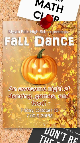
i have a scene in my story where there’s a poster for the school dance and so i made this background but it looks… really awful and it doesn’t even look like a poster tbh
does anyone have any feedback on how i can make it look more like a poster? i put a pin thing but it still looks super unrealistic and looks really off but i have no idea why
(also it’s supposed to be on the school bulletin board which is why the background is cork and there’s other posters around it)
3 Likes
The only problem I see is that the poster blends too much into the bulletin board, besides that I really like it!
1 Like
The poster is a bit too bright and the font is a bit boring, also, that pin looks a bit too large, but otherwise, it’s really nice 
1 Like
On top of the other advice here, I would personally take the shot back a little. Do a couple more posters around it to make it look more like a bulletin board. Personally
2 Likes
Personally I’d say make the pin a little smaller if you can. Relative to the size of the pin, the poster looks like it could be just a little bigger than a postcard
3 Likes
Add like a small border to the poster it make it pop out as well.
1 Like
