So, I have been making adverts for about a year now. I started making my own edits because I was going into the graphic design degree at the time. Still, going to school for that but I will be taking a leave of absence until next year. I also noticed that a lot of people were just taking pictures of their stories or screenshots of certain scenes to show off the new episode they released. I kept seeing the episode ad’s for their featured stories which made me start thinking about creating my own version of ads. I actually joined Joseph Evan’s patron subscription to see some of his videos. Those videos also led me to get the initiative to make my own. I suggest he make adverts as one of his training videos which he actually did it since it won the poll lists. I combined both the knowledge from his cover video, overlay video. and the advert video to pick what I could use on my own. I will list the steps I go through when making my adverts. There are three good ways to make adverts, covers, fps, and overlays. These steps can be used for all the ones I listed in the sentence before this one.
First Style
Step One
This is the classic style that I have used since my first edit. It takes the most time to do this one but once you have gotten past the time-consuming part it gets fun. First thing, you will need to do is to put your character you will be using on a solid background. You can do this with either the app or the web portal where the character section is listed.
If you use the app then you will need to open your story to an empty episode or make an Advert Episode Story as I did. You will need to place the characters in the desired placements in the script preferably. Like this:

Now, if you want to use the computer instead then I would suggest going to the character section. Pick the character you want to use plus have them in the outfit you want them in as well. Once, you have the character setup correctly choose the animation that you want them in. After that take a screenshot of the image. It should look like this:

You will do this with all your characters as well. Once you have them finished you will need to get the dialogue for the advert. You can use the episode dialogue boxes for the advert to give it an episode style to your advertisement. If you use the episode dialogue then you will need to do take a screenshot of the dialogue through your phone in the test story app section or web portal on your computer. If phone then it should look like this:

If you use the computer web portal then it will look like this:

It’s only the episode dialogue that needs to be done at the same time as the characters.
Step Two
This step entails getting the characters set up for adding the background. You will need to erase the solid background behind the characters. The other way is to erase the background with the eraser tool. Yes, this is a time-consuming part but it’s worth it in the end. I will post images that reflect what I mean. Now, you will have to color in the areas that close to the edges of the image depending on how strong your eraser is when using it. I would suggest using an eraser that fades out so that you can go back in to fill the sections that you didn’t mean to erase. You will be using the undo button for a good portion of the mistakes you make but the only con is that if you erased a huge section with one stroke then you might lose all of that progress. I usually erase section by section when I make my edits. There will be sections that look ruff but once the characters are on the background you can barely tell.
If you actually erase the background with each stroke:

Depending on how you erase you will need to check to make sure you got all the background erased. To do this make the second layer of a solid color so that you can see the areas you missed. The color should be something that you can see the specks or sections really easy. So if you use a light grey background use a solid dark color to check with but if you use a dark background then use a light color to check with instead. I usually zoom in until I can see almost all the pixels when I erase. I will show you what I mean.

You can see the amount I have it zoomed in at is 300%. I will go over the whole image at this zoomed-in level to erase each bit of background. You will need to be careful since you can accidentally erase part of the character but that’s what the undo button is for.
If you decide to got with the magic wand tool instead there is a way to adjust how much is cut away with the select tool but it just takes a lot of work in order to do so. It’s not something I do often so you will need to look up how to do that on youtube. I know it has to do with the different types of choices the magic wand lets you choose from. I prefer the other way versus using this tool.
Oh! If you start erasing on a character’s background which only turns white instead it means you need to add an alpha channel. You will need to right-click on the layers tab like in the pictures below then click add alpha channel if there isn’t one already in place. Most screenshots have alpha channels but there are some that won’t you just have to check.


Step Three
You will need to make your title for the story that you are advertising for. This can be made in a separate layer or even a new tab. I would use www.dafont.com for different fonts though I will give you this warning. They are commercially free to use in apps like Episode or even Wattpad.
ONLY USE THE PUBLIC DOMAIN OR THE 100% FREE FONTS!
I usually use long shadows to give the title more definition when making them. This is mainly an image I was using to show off the font. You will see what I mean later on in this tutorial. Here are some examples of title overlays:

Step Four
This step is putting together the advertisement. When you start this process you should already have the above steps done. You really do not want to do this backward since it can be hard to fix mistakes. What I usually do is create a square that matches is close in length to Instagram size requirements. It will make it easier to promote this way so that you don’t have to worry about it being too big. The lowest I have gone too is 600x600 but the highest would need to 1080x1080 for a proper Instagram picture. It’s best to know the requirements for any image you need to post this is including making episode splashes too.
Once you have the new image created you will want to start adding the background, characters, title (if not made yet), and dialogue boxes into the image. You will need to have already picked the background for your picture. This will need a public domain picture, episode background, or background where you get permission to use it from the creator.
I MEAN IT WHEN I SAY GET PERMISSION!!
Note that the characters used in the images below are not part of the actual story that the title is connected to.
Create the background image:


You can move the background around until it’s in the right position. Make sure you have the layer you want to move clicked otherwise you will move the wrong section. You saw the little eye icons next to the layers. You can use those to hide certain parts of the image while working. So, say you want to make the title but you don’t want to go to a new tab to make it. The best solution hides the background so that you have only the white background showing to make the title like this. I tend to make the title second to last but I thought I would start with it second instead.
Making the Title:


When making the title hide the background image as shown in the picture. Choose the font, font size than the shape of the text box when making the title. Once you are finished you put the title where ever you think is a good spot. After this, you will need to add your filter to the text which I usually use the long shadow filter. I choose a complimenting color to match the font then pick the angle and length of the shadow. It’s best to zoom in when doing this part so that you can see the colors better. Zoom out once you have the colors in place. Just so you know that if you need to change the font you will lose any filters that are on the text. So, make sure you are happy with your choice after you have made it. You can actually hide the main white background so that all you have is the text. This way if you want to save the text on its own it gives you that option. Don’t forget to click the move button otherwise the filter will pop up again. Just cancel it out then click the move button if that happens.
Now unhide the background and lets move on to characters:


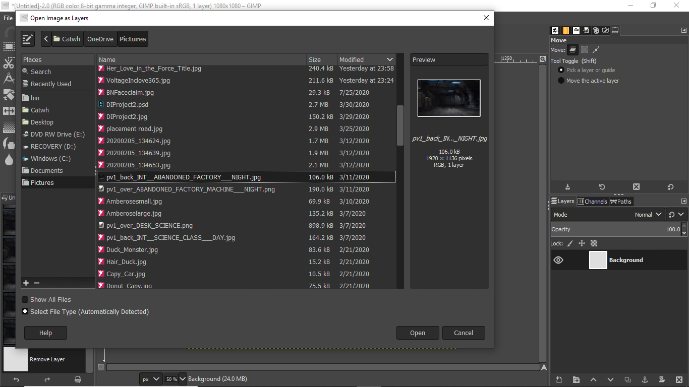
You will now start adding your characters to the image. Go back to files to click the open up as layers button. If you have a character facing the wrong direction then just flip them over. Make sure you have clicked the right character. They should have a yellow lined border around them. Make sure to move the characters where you want them to be placed. Now we add filters to the characters. Once you have opened the drop shadow filters place the shadows according to the placement of the characters. Make sure you click okay when you finish with the filter otherwise it will not save the added effect.
Now onto the dialogue boxes:


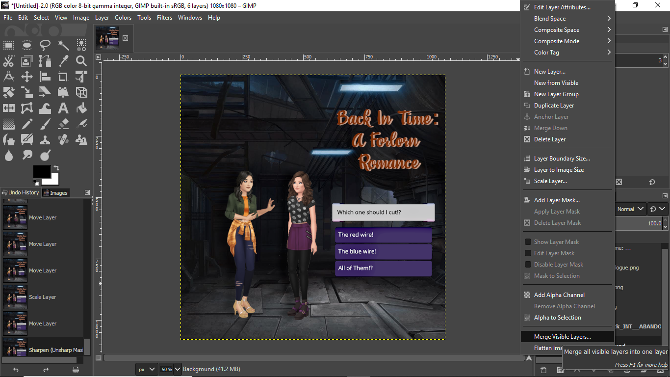
So, go back to files click open as layer again then choose the dialogue overlay for your advert. You will need to size it to the correct sizes to complement the whole image. I also tend to put a sharpen filter on the boxes to make them visible once you put the last filter in place. Now that you have all the pieces in place it’s time to merge them into one image. You will click on the main layer which is the while background part. Right-click on the mouse then click the button Merge Visible Layers as seen in the picture. Once this is done, you can add the last filter in place.
When you have selected the final filter an adjusted it to your liking:


You can use the regular artistic filters or you can download the G’MIC-QT plugin for Gimp. I would suggest looking on youtube on how to add plugins to Gimp. It can be confusing otherwise. This is GMIC-QT which has over a hundred different types of filters to choose from. It comes in handy for a lot of my images. Find the right filter that you like to use on your image. Mess with the controls to get the look just right. Then hit okay to apply them to the image.
Final Product:

If you go by the mobile phone version where you already placed the characters in the right position with the correct background then you go through these setups. For both methods, I would highly suggest that you take a separate screenshot of the dialogue box with no characters in front of the camera. You only want to see the dialogue box. Then cut the overlay out.
Pre-placed characters: First way!


You will want to hide the debug parts in order to not have all the buttons in place. Here is the post that shows you how to do that. https://forum.shanniiwrites.com/t/episode-tutorial-the-app/10619/2, the next part you will need to do is crop the image to the size you would like. Then you can add in the filters this way. The only issue with this method is that the background can’t be moved around as much as you would be able to in gimp. It’s bound to the size restrictions of the web portal.
Final Result:

Now there are the other partial placed characters:

This is where you place the characters in the scene with a solid colored background. You will then proceed to hand erase the background or you can use the magic wand tool in order to cut the characters out. This can make it easier with dealing with multiple characters in a scene at certain layers. You will also be able to move the background to the place you want it to be. You will still put the title in as shown in the first 4 steps. Add the necessary filters and whatnot. If you are using limelight then I would suggest adding like a poster board type filter to give the background a more cartoonish look.
Final Result:

Let me know if there are any discrepancies in the tutorial. I will try to fix them as quickly as possible.