How do you like it?
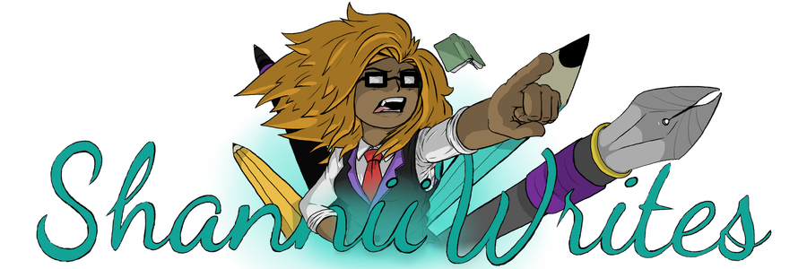
Other new logo
It looks too dark for me, it looks like parts of it are transparent ![]()
I literally just explained my adversity to change!
I personally think it looks really really good
In my opinion I like the old one better
The new is still good!
The authors nails are painted ![]() awww
awww
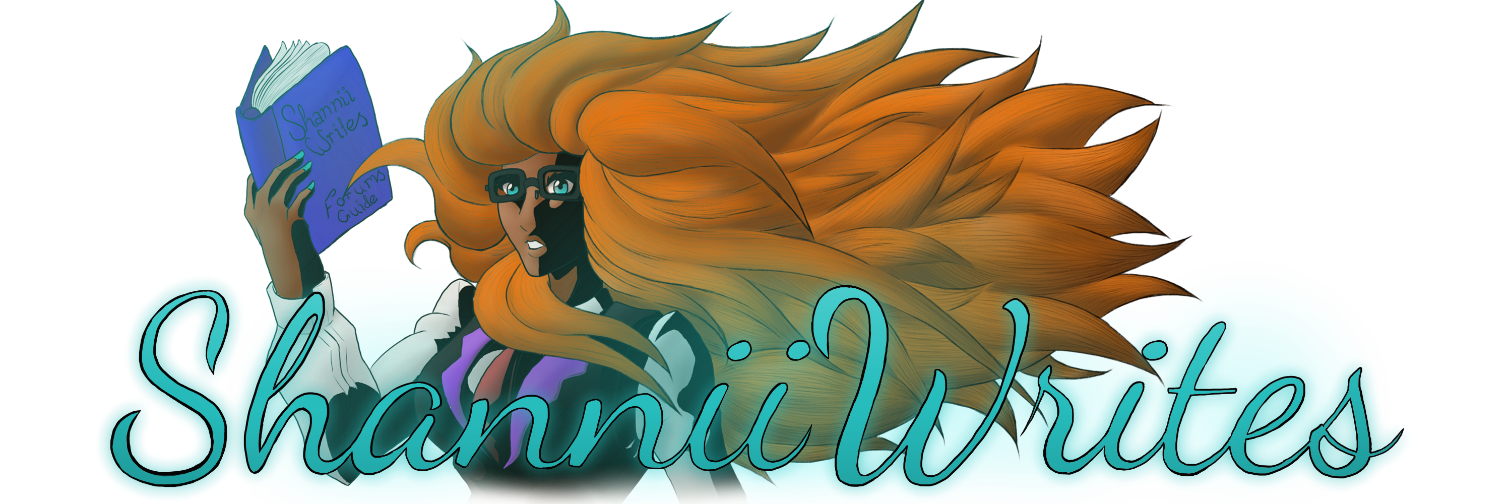
HEHE. Yes, and the tea time one is only seen when you scroll down a page. I think that’s a pretty cool feature too.
Aaahhh it’s so prettyyyyy
I also prefer the old one. The writing utensils look neat extending from it and it creates this cool aura
I think it’s rad, but the dark bits blend in a bit with the background in dark alt ![]()
![]()
I prefer the old one.
The new one looks a lot flatter in comparison to the old one.The new logo also has a kind of strange anatomy, in the body as well as flow of the hair.I’m also not that fond of the facial expression either.
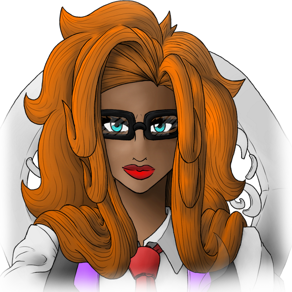
This one is cute though, her face is very cute and the eyes are very captivating. The background does still seem kind of awkward and confusing.
This is beautiful!
Same!
The new one is pretty! But I think the old one had that "it’ factor that made me like it more.
But the close-up is amazing! Her eyes are mesmerizing
I personally don’t like it, I like the older one better, but it’s nice.
I just want to state-
That it scared the FLIP out of me because from far away it looks like a ghost with glowing eyes- But the close up is GORGEOUS. Thanks for coming to my Ted talk, love this site either way!
I prefer the old one as well.
But the close-up of the new logo (the one with flowing hair) is stunning!
It looks really really good but some of it looks like its transparenttt but OMG THE AUTHOR LOOKS SO NICE WITH THAT HAIRR
The second one looks rad too but its just the background which doesnt look much appealing to me ![]()
smexy eyes ![]()
The artwork is epic, but for dark themes, the shading and the vest looks transparent from adar ![]() I love the small one, though! It looks stunning!
I love the small one, though! It looks stunning!