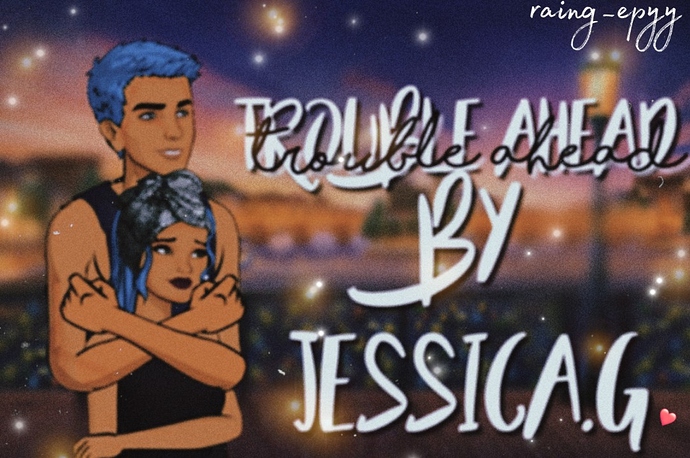
What do you guys think
Move the thread to art feedback and added the episode art, opinion and help tags ![]()
Also, now on to my advice for this piece. The custom posing, font and background all make sense and it looks good, however that’s one thing that bothers me, the fact the 2 characters are nowhere near good quality image. Idk if it’s a layer you put above them or if the screenshot of the characters are just really bad or a combination, do you take screenshots on the previewer on the laptop or phone?
Also another piece of advice, the characters look a little boring, compared how much effort is into the posing it could be a good idea to get into editing of them a little more. If that’s something you are interested in I can help you with that ![]()
You should remove the black writing, it makes the white too hard to read
It’s alright. Try and make it more HD though. Is that possible? ![]()
It’s a filter
Personally, I think it takes the attention away from the good art piece and it would be better without the filter, but if you like it you should totally keep it ![]()
Maybe you should use the filter on your characters?
