Serif and Sans Serif are known to be the two biggest groups of typefaces. But what is the difference between the two?
Serif fonts are fonts that, of course, have serifs. Serifs are decorative strokes that are added at the beginning or at the end of a letter.
Examples of Serif fonts: Times New Roman, Cambria, Georgia, Courier
On the other hand, Sans Serif fonts are fonts that don’t have serifs. Sans Serif fonts have straight, precise lines that have the same with throughout the end of a letter.
Examples: Arial, Helvetica, Comic Sans, Century Gothic
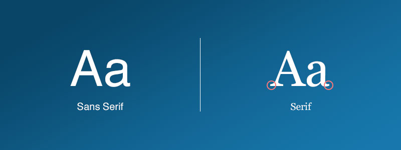
Here’s an image that shows the difference between the two:
Serif fonts are typically used in classical or traditional approaches. On the other hand, Sans Serif fonts lean more towards simplicity and minimalism. Personally, I prefer Sans Serif fonts more because I’m more of a minimalist person. How about? Which one do you prefer between the two?
These two font types both have their uses, actually. Generally speaking, serif fonts make long texts easier to read - which is why they’re used in published books. Sans-serif fonts, on the other hand, make short texts easier to follow. That makes them preferable for ads, banners, book covers, comic book speech bubbles, internet forums and other short forms. Some say they’re also preferable for mobile devices, because there’s only a small amount of text showing on screen at any given time.
I wouldn’t say I have a preference of one over the other - both have their uses and both are awesome at what they do I do have a problem with online stories presented in sans-serif, though. I have headache problems, and the extra effort of reading long texts in sans-serif makes them worse >_<;
It really depends on what I’m doing. I find that I do most of my school notes in sans serif fonts, but I tend to do my formal assignments in serif fonts. If it’s something I’m doing for myself, then I just choose whichever looks the nicest.
Arial is also my go-to font , along with Century Gothic. But most of my professors don’t agree with me since they prefer Times New Roman and Calibri more smh