Art Critique Thread

Plus working from real anatomy. Every single Episode edit artist out there can make better stuff than the Episode style. They just need to break out of that poo and make their own style from the start.

It’s never good to learn from other art when it comes to drawing people!

7 Likes

So… I’m trying to do edits to make backgrounds but i don’t know how to use photoshop, so I had to manually draw over the things I didn’t want in the finished background
Here is the background (still a work in progress- but so far my first edit)
Wizard%20edit%20in%20progress

Original:
Wizard%20Edits

I still have to add a few things- criticism wanted!

6 Likes

Sorry if I’m just blind, but what’s the difference?

3 Likes

This was a badly edited one hold on:

Wizard%20edit%20in%20progress

I didn’t like the stuff on the podium/chimney thing

It’s still in progress lol, I just haven’t really worked on it

3 Likes

So, I’ll just go point by point on what makes it good, and how to improve on those and what is making it fall a little short.

So, first of all, the anatomy is actually very good. The shoulder and neck line match up quite nicely with the head and action line, I like it. It’s interesting! The head may be turned to the side a little too much? But it’s barely noticeable, honestly.

The hair girl, the HAIR is gorgeous! That’d be a bitch to colour and shade, but it would be so worth it! there’s really nothing wrong there it’s stunning!
You placed the eyes really nicely, they fit really well with the rest of the face and I really like the colour. You also have quite a natural talent at material folds? I had to learn that from scratch and it’s super difficult. Also something that you are. Never a master at, trust me xD

I also really like those flowers, even if there could be more definition to them. Some colour would do that though :smiley:

I’d say the main things to work on would be practice-based. There doens’t seem to be much wrong with what you’re actually doing if you know what I mean. Maybe make the lines more confident? Nice, single strokes are generally what you want to work towards. I’m still practicing that myself, it’s a long process.

That and keep up the work on faces. They’re the hardest part of the human body to get perfect! Those lips are real good, but they could use a little more definition to bring them out as a 3-D object if you know what I mean. Same with the nose, but as I say. It’s incredibly difficult.

Keep it up, all the same :wink: I’m excited to see more

3 Likes

Thank you so much!

Thanks! And I’m low-key dreading that part because shading hair is my enemy :cold_sweat::cold_sweat:

Yep, it took a long time. I think what helped most waa I bought some lessons of a udemy class site so that really helped.

Thought so to, not the best at drawing flowers or scenery but I try.

Copy that cap. :wink:

I get you.

Thanks so mich, this is exactly what I needed! :gift_heart::gift_heart::heartpulse:

3 Likes

Anytime :3

Happy drawing <3

3 Likes

Well here are some edits I have done. I would like some feed back. I don’t draw anymore.

Edits

Background for my Colonial story

Orginal picture

Someone posted an art contest to color this outline on Episode Forums

Advert for College Days story (most recent advert for myself)

5 Likes

Sorry for the late response, Discourse decided I didn’t need notifications for the thread I want to dedicate most of my time to >.> I’ll need to keep a closer eye.

If you still want feedback, I’d be happy to give. Though to be honest I’d probably also be useless with Episode edits, I have no clue how to do them well xD

3 Likes

Your good! You can give feedback as best as you can. I haven’t drawn in a couple years so I’m rusty on that part.

3 Likes

I think the one thing I can say is mostly a personal thing from myself. Since the coloured outline I think is fine, since you didn’t do the outline. Though in future, it’s cool to play with trying to add volume through just colour. Like on the hair, if you use a few different shades to bring across there being different streaks of hair waving in and out of each other. That’s just me tho.

The more recent piece isn’t something I can say too much on, I don’t know enough about edits really xD

As for the backgrounds. This is where my personal opinion comes into play. I personally don’t think Episode characters look that good on highly detailed or realistic backgrounds? Though the issue with that is Episode itself likes to use hyper-detailed realistic backgrounds, so you would have to do every single background by hand if you wanted something that actually matches the characters. Because the characters are fram from detailed or realistic. I dunno, it’s just something about Episode that irks me. As it stands, that room looks lovely. I would love it I know that much xD

3 Likes

Thank you! Yeah, I know what you mean. It really is annoying about putting episode characters upagainst that type of background. I still use it for my American Revolutionary story.

3 Likes

I’m not really sure how to do multiple colors in the hair. I still need to learn how to blend and make it look natural.

3 Likes

Thing is, you may not even need to blend. Hair has quite sharp edges between colours and shades and highlights. It’s something to play with for sure, I just looked at Google images a lot to get the basic idea personally.

Though there are other ways to do it. Hair is really light so I know a lot of people who applied elements of fluid dynamics into their work since hair adheres to those laws. It’s interesting to mess about with it and see what works best for you

3 Likes

What do you use to draw?

2 Likes

Thank you for the tips. I will try that out!

3 Likes

I’ll post some of the images when I get back to my old computer at the hotel. I used to draw objects and animals.

2 Likes

@Talu @ChaoticDeluge

Other Drawings

Book Concept

Finished Book Result

Little drawings (Bottle is bad)

Dimension Concept

Another Items Collage

Water Color Pencil Drawing

Owl Picture Original

Owl Drawing

Room Layout

5 Likes

Can I get critique on this?


I think the proportions are a bit off and the cape shading is ew since I’m still working on my style… Nevertheless, I’m still open for critiques… Be. As. Brutal. And. Hurtful. As. Possible.

5 Likes

So I’m not gonna be hurtful or brutal xD But, I’m gonna be honest.

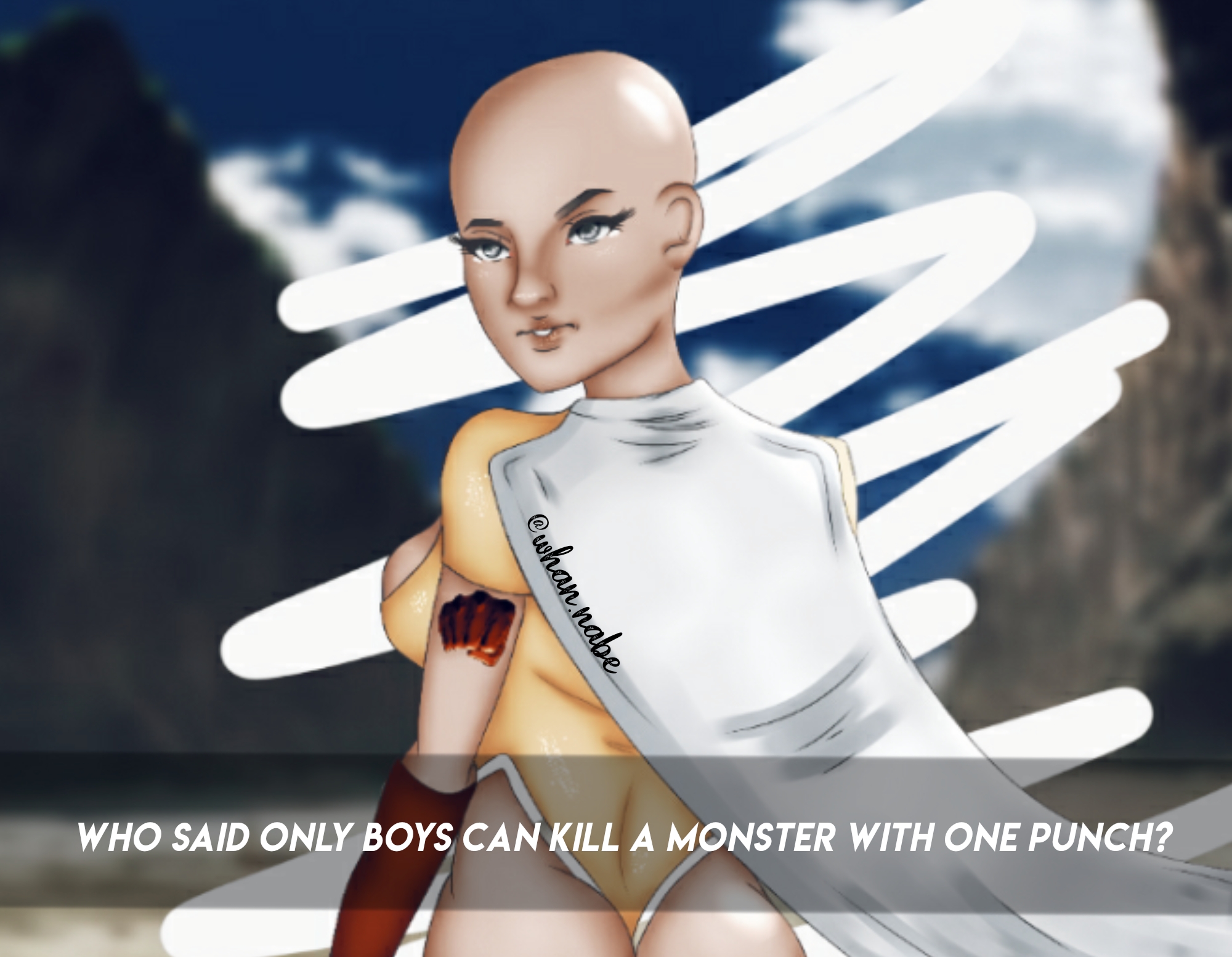
I’m interested in how sexualised it is, if it’s just a gender-bent Saitama. He just wears a shirt and washing up gloves xD If that’s the direction you wanna go, go for it though! :smiley:

So, for starters, the cape. Material is difficult, but Saitama and One Punch Man in general is actually a masterclass in how material can be drawn really well. His cape is attached at two plates on his shoulders, around the collarbone area. So the material bunches up around them and then flows up and over his shoulders. So the folds would actually go down and from the shoulders and neckline, it gives it a lot more volume.

I don’t really see any issues with the face. It’s not really a Saitama face, but it’s fine as far as faces go.

As for proportions. The proportions are actually fine. There isn’t really anything that looks like it shouldn’t be the size it is. It’s the pose that looks a bit off, I think that’s the main issue with the piece if I were to pick. To be able to see the face in that kind of three-quarters side profile view, you wouldn’t see the shoulder that far forward, it would be further back. Her back also wouldn’t be in full view, and the butt would be more side-on as well. The shoulders, back, butt and boob that are in the shot all go well together, but her face is then in the wrong place. It just doesn’t really work.

A test for the future, try and do the pose you have your character doing in fron of a mirror. If they’re looking at the [camera] then you should be able to look at the mirror. If you tried this pose, you probably wouldn’t be able to look at the mirror, not even out the corner of your eye.

Aside from that, I love One Punch Man, so this is a fun piece in my opinion :smiley: The colours are a little desaturated but it works for your shading style. I would say what to work on after doing a bit of practice on posing is how shading and highlight really works. Having a light source in mind that dictates where shadows and highlights are on the character in focus.

Keep it up, I hope this was helpful in some way!

3 Likes