Late, but thank you for the feedback!
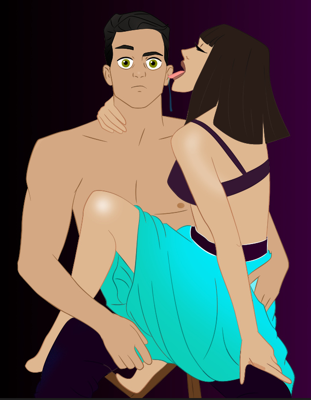
This was Episode Style, reason why it doesn’t match Saitama’s face. For the proportions, I wanted to emphasize “Thick and Cartoony”, the desaturation is actually because of a filter because I hated-ish the vibrant version of the piece thus I slapped a filter lmao.
3 Likes
ooooh, yeah I can see the Episode face now >.<
3 Likes
3 Likes
Honestly I think it works for what it is! The only thing I would say would be to make the font bolder, bigger, or use a more easily ledgible one. Aside from that, the idea is sound for what it is!
4 Likes
thank you
3 Likes
Anytime!
3 Likes
@fcukforcookies I know your good at doing edits. Do you have any thoughts about these? I would like to get them critqued if you are okay with that.
2 Likes
I’ll reply when im on laptop)
3 Likes
As per background. I see the majority of background makers do the same thing (no offence since you asked for my opinion, and I only mean to help), they add random objects to the existing background but don’t really take notice of difference between perspective/angles. Imma give examples.
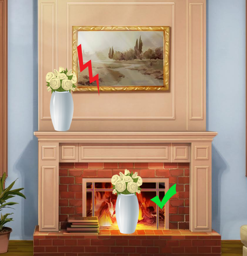
The same vase. But when you look at it isolated, judging from its base it is obvious that vase was “photographed” looking at it a bit from the above. So it looks very harmonic somewhere closer to the bottom of the room. If you put it on the eye level, it kinda looks a bit out of place. Always look for perspective and angle.
Second thing, and this is not THAT crucial, but it makes edited background look better.
Look at these two examples.
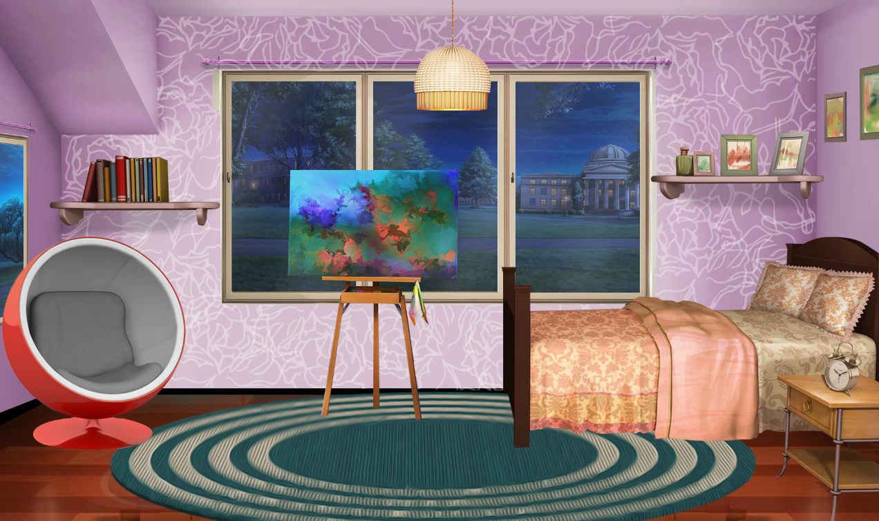
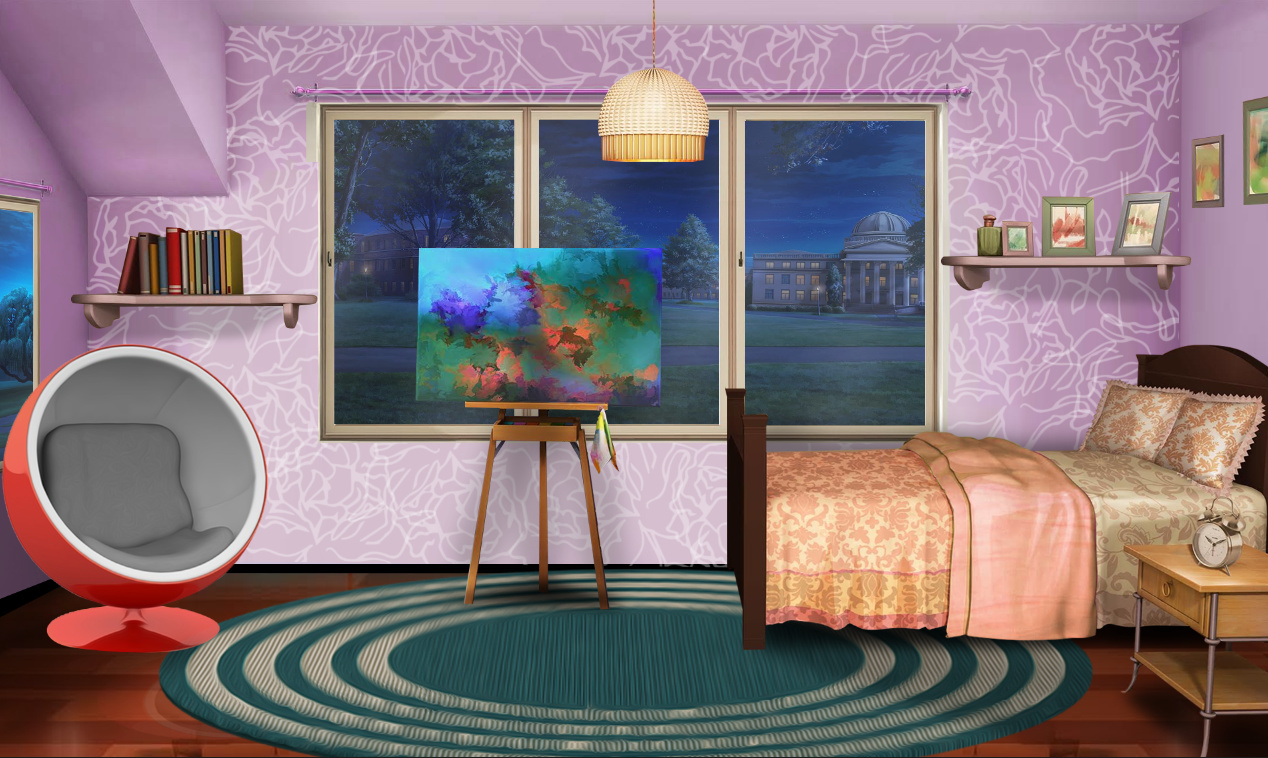
The only difference are added shadows from the bed, picture and chair. Shadows add a lot of depth into the background, and make it look MUCH better.
Outline contest. I don’t like the outline itself, no offence to someone who made it, but I’m kinda overall over episodish art tbh xD If you want to progress with art and edits, start adding shadows, highlights structure. This looks like a flat base color and nothing more. Check the difference. There arent many details added, but they are and they make a lot of difference. I love to use gradient on skin, hair, cause I feel like this adds to the deets as well.
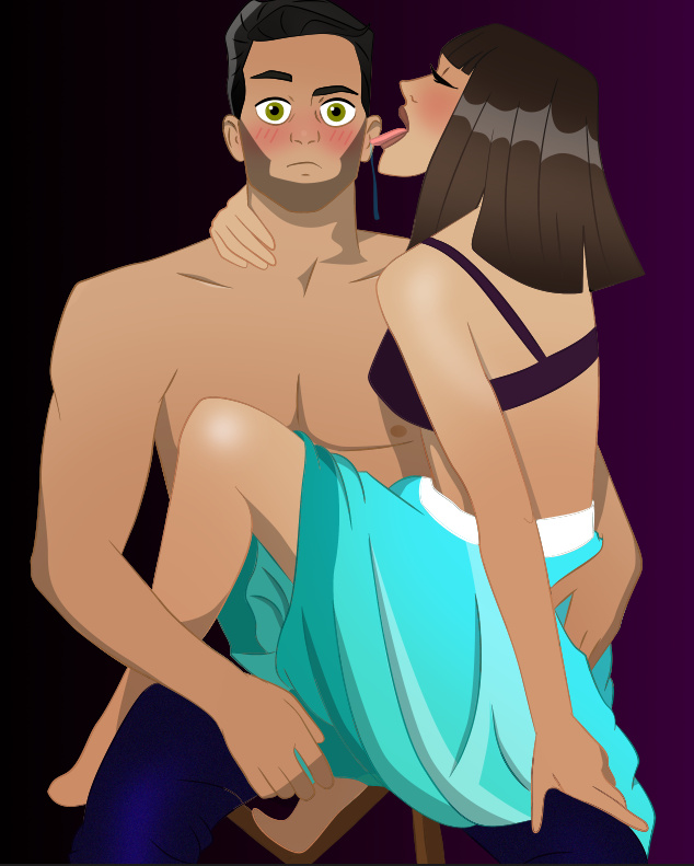
Out of all of this I like edit the most. I like the effect. Few things tho. I kinda see that the image itself was stretched horizontally for some reason. It’s not that visible when it’s a full face, but when the head is tilted etc.,it’s pretty clear.
I’m also not a fan of the font, and effect used for text. The color is kinda not fitting, in my opinion at least. I don’t like that “a” has its own line. It does make more sense to put text on top, definitely choose different color, maybe white with a tad of transparency (20-30%), maybe with some outline.
When I’m making a cover I always search for new fonts. There’s so much of them available online, and for free.
There, I hope it was helpful, and you don’t feel discouraged. I’m a tough critic kinda, ask @TessS xD
7 Likes
XDD she is xD but she pushes you to do better :))
4 Likes
awww ^^ sucker xD
4 Likes
Moron xD
4 Likes
Thank you! I’m okay with everything you said! I knew I could do better with these. I will keep in mind everything you said when I continue doing edits!
7 Likes
She is very helpful!
5 Likes
I have no problem with @fcukforcookies joining me as a critic on this thread, she so damn good at it ![]()
5 Likes
![]()
8 Likes
Added an art tag ![]()
3 Likes
Bump ![]()
3 Likes
Gonna bump this because it’s helpful!
2 Likes