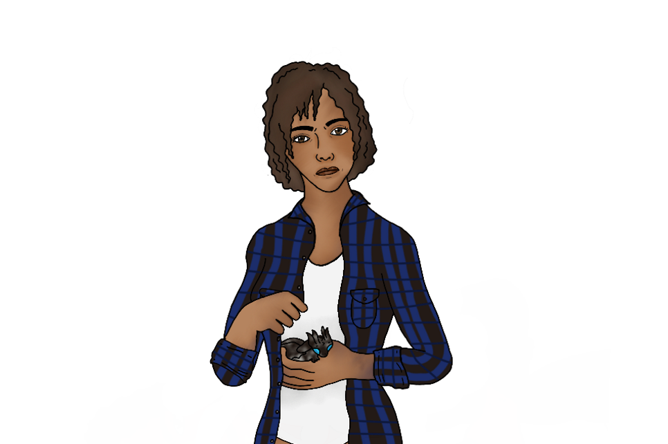
I am currently working on colouring it in, but I quite like the black and white actually
4 Likes
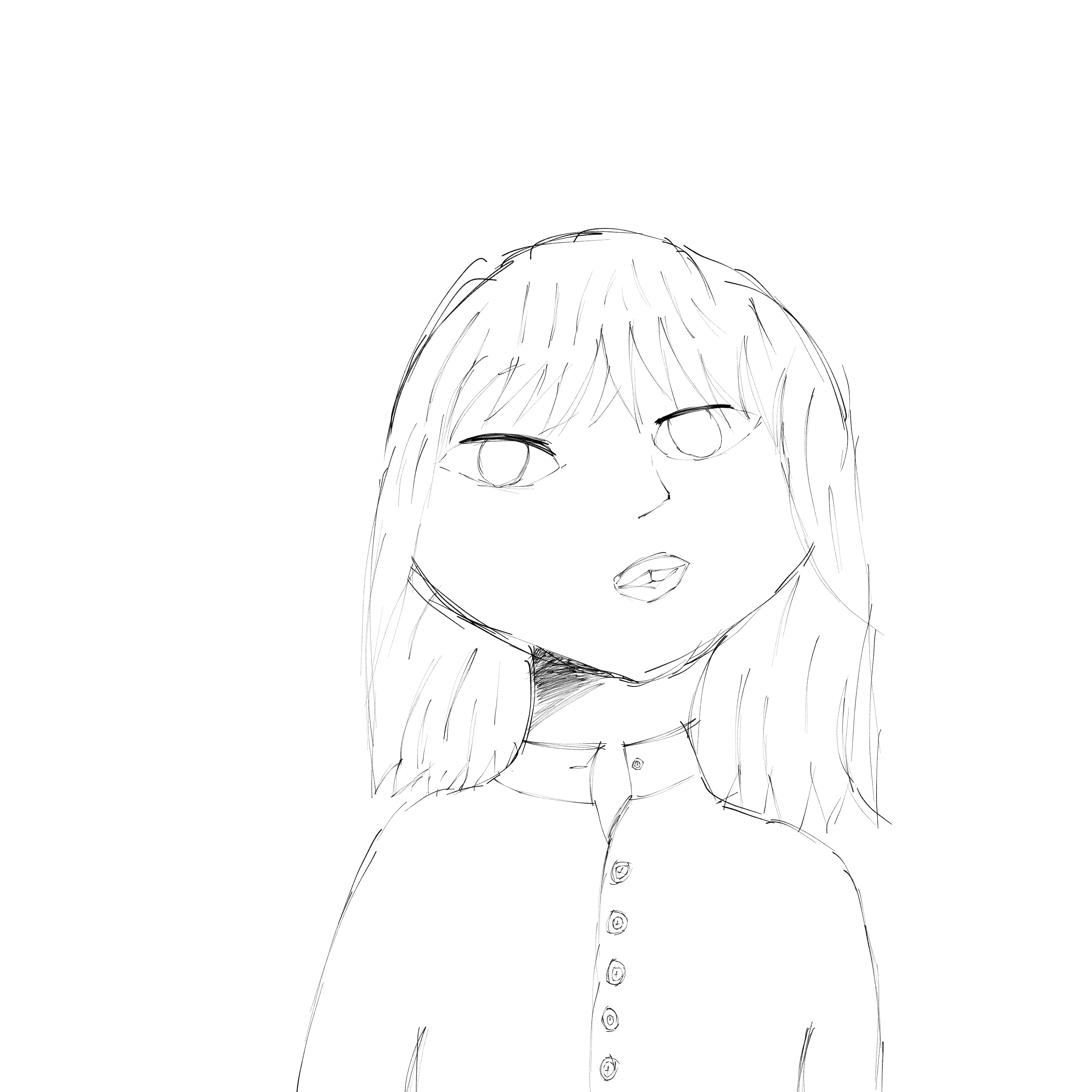
so only an outline, but working on a big and large cover, any advice on how to improve them


edit. finished work

4 Likes
Love it! It’s so you.
3 Likes
I like it but maybe work on the eyes in the big picture. Her eyes look a little off. Though I have my phone in dark mode. It looks good though!
2 Likes
Thanks! Yes, it is xD
3 Likes
Honestly the only thing I feel you need to work on are the basics that take practice anyway. Stroke confidence, anatomy, etc. Everything’s there, you just need to tighten it up!
4 Likes
I love the hedgehog.
It has quite a nice almost collage feel to it. The colours are really nice, I’d even say you could lean into those background colours and have a wash of them over the character. That’d be neat
4 Likes
ArtBump
1 Like
Bumpity bump!
1 Like
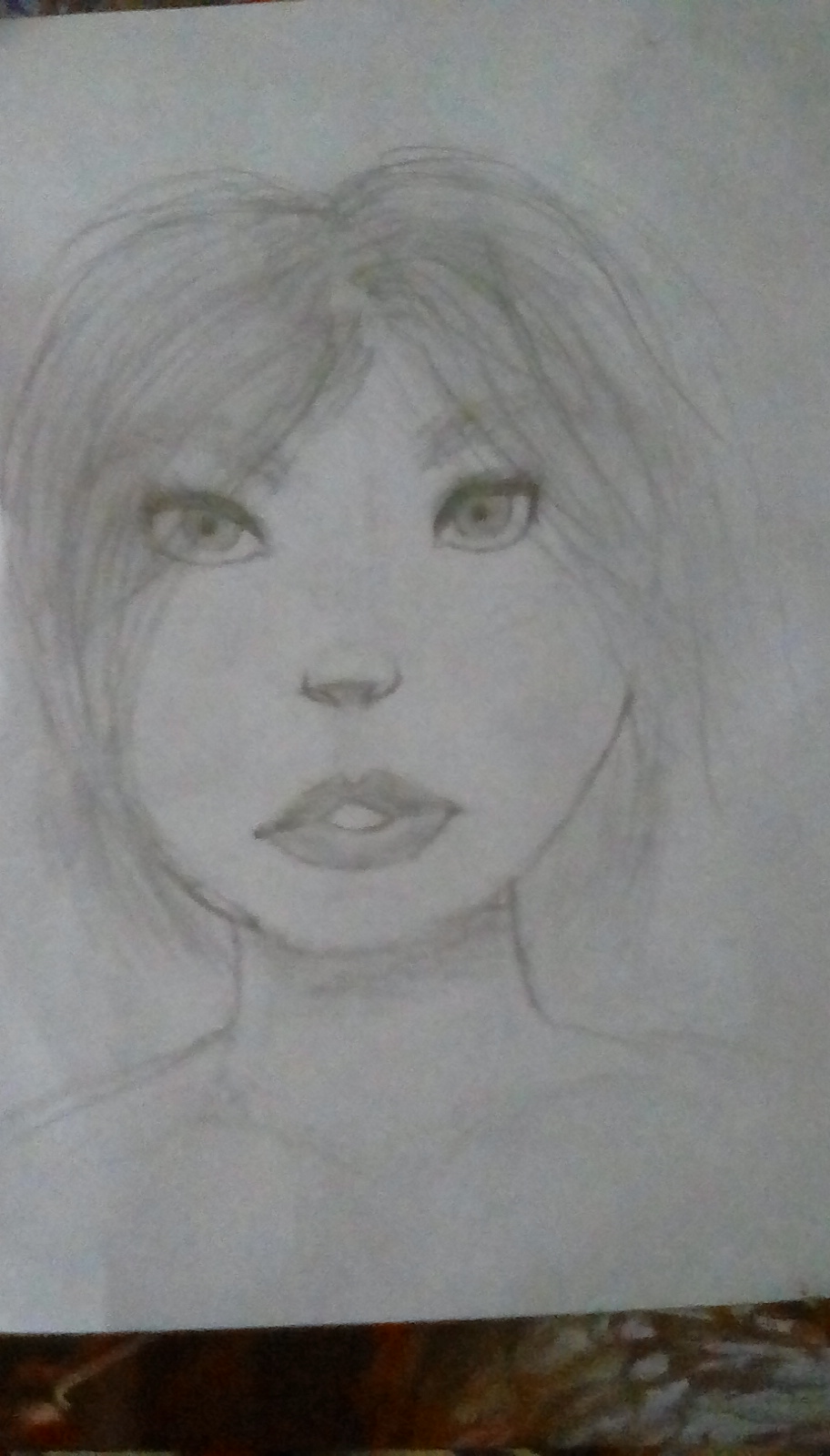
You seem to have a pretty good eye for facial structure, though it could still use a bit of work. The kind of improvement you can only really get from doing it over and over again. May I ask, do you use guidelines?
3 Likes
Thank you for the advice ^^ Not really, when I’m drawing the eyes I mark lines so they’ll be about the same position and size, but that’s about it.
3 Likes
Then my advice for general improvement would be to try out doing some faces using basic guidelines! I use the Loomis method personally, it works the best for me. But everyone kinda figures out their own way of doing it before long. Obviously you don’t need to do this stuff, but practicing using thiscan really help with structure and proportion!
Drawing from life is also helpful, but you have how facial features look down pretty well, I don’t think that’s a huge issue

5 Likes
Lemme share my two cents on this xD
I dont agree that you dont need to do this. Everyone kinda should do it. You have to study the anatomy and structure if you want to get better and are serious about art. I would even say people should go deeper and practice planes of heads, until they understand it. Because when someone decides they don’t need to do that and they will just practice the same wrong anatomy they do all the time now all over again, yeah they can start getting for example positions of eyes right from pictures, and etc, but it still wont be as good as if they would study it properly, and it will look flattish and not at all 3D. And the planes also helps out when you are shading. You can also go and find different methods if this ones don’t work for you, but study the anatomy somehow,if you are serious about this.
model of head with planes if anyone's interested
https://sketchfab.com/3d-models/asaro-head-9d26548182f8465a8e97371a9170561e
3 Likes
Oh yeah, I completely agree. I was more saying you don’t need to expressly. Just look at artists like Rob Liefeld. You do not need anatomy knowledge to succeed ![]()
However, if you want your art to excel then yes, studying from life is always important
2 Likes
True ![]()
3 Likes
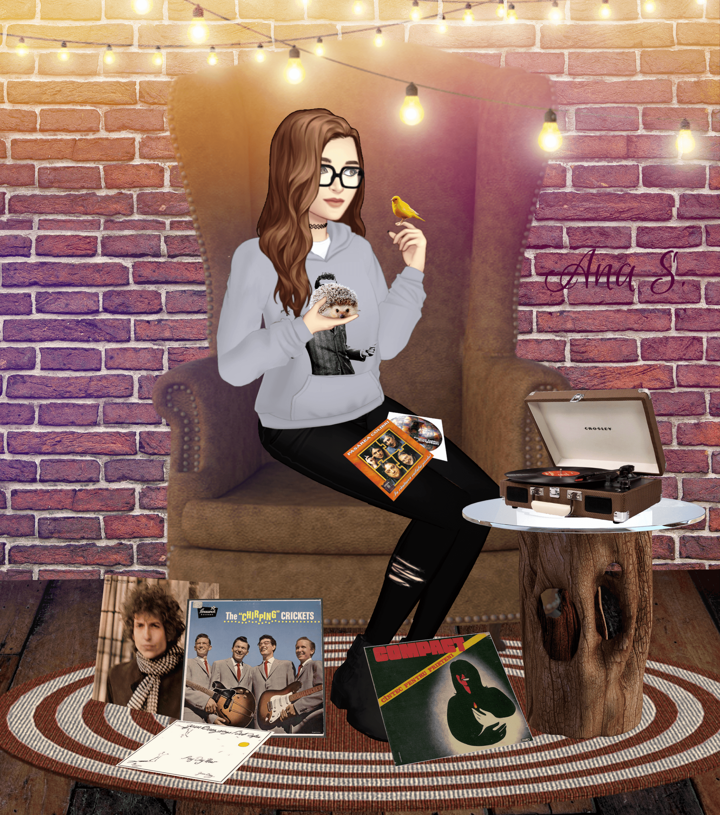
So I made this duud yesterday, but can you guys maybe give me some tips or overall critique on what to do better? It looks okay, but I feel like some things are still a lil off…
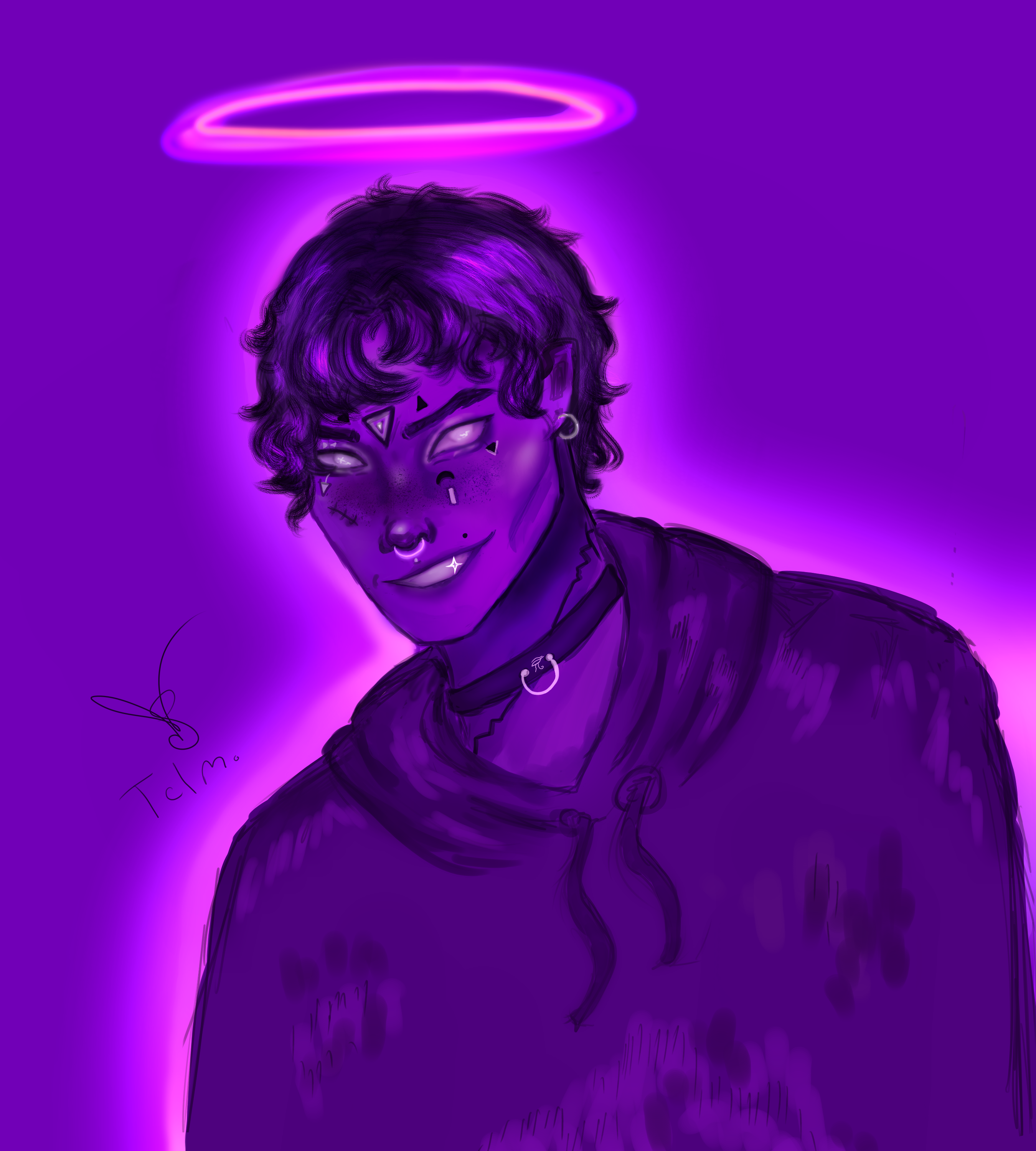
Any ideas on how to improve clothing textures and stuff? THANK U.U ![]()
![]()
10 Likes
I think a lot of the basics are definitely there! Facial proportion is pretty on point, the hair texture is excellent. Though they do look a little… Wet? ![]() That’s the problem when you’re going for highlight and shadow, skin doesn’t gleam like that unless its very wet. Though that’s very advanced stuff.
That’s the problem when you’re going for highlight and shadow, skin doesn’t gleam like that unless its very wet. Though that’s very advanced stuff.
The first thing I noticed was the hoodie looked a little flat. The thing you need to think about for this is how the body works, and what the body is like under those clothes. Then you can think about how the material of the hoodie would sit on the body. For that you’d think about how heavy and thick the material is, how it folds and falls over different parts of the body. The only way to really get this right is to do it from life. Draw hoodies from pictures, get folds and such down by draping your own clothes over chairs and stuff to get those nice folds.
I also noticed the choker is almost a straight line. At that angle the curvature would be much more dramatic, as it would wrap around the neck. And the ring would probably be a little more to the side, in line with the chin.
The only other thing would be lighting! I love the glow effect, it’s very nice, and the colours are excellent. However, having a light source will always help. Shadows are always cast on the parts of the body the light doesn’t hit, and blends into the highlighted areas as the human body naturally has curvature to it.
5 Likes
I also think there’s some work you can do on facial proportion, but that comes with practice!
4 Likes