See! I knew there was something wrong with the hoodie, but I just couldn’t see it ![]()
And yesss the face!! I never draw guys so it was already out of my comfort-zone, but eh? As you said, it’ll come with practice!
Thanxuu for the advice, jeebus knows I needed it ![]()
![]()
3 Likes
Either way it’s an excellent piece, and if you work on those areas your future work will really shine! ![]()
3 Likes
Thank you! I want to join an art school after I’m done with High school… But I’m still 14 so I have plentyyy of time to practice untill I get there! ![]()
3 Likes
Oooh, my time at college helped me so much with my art, my lord. But as always, the best advice is always:
Practice, practice, practice!
2 Likes
Oh, I will! Thanks again for the advice! ![]()
![]()
2 Likes
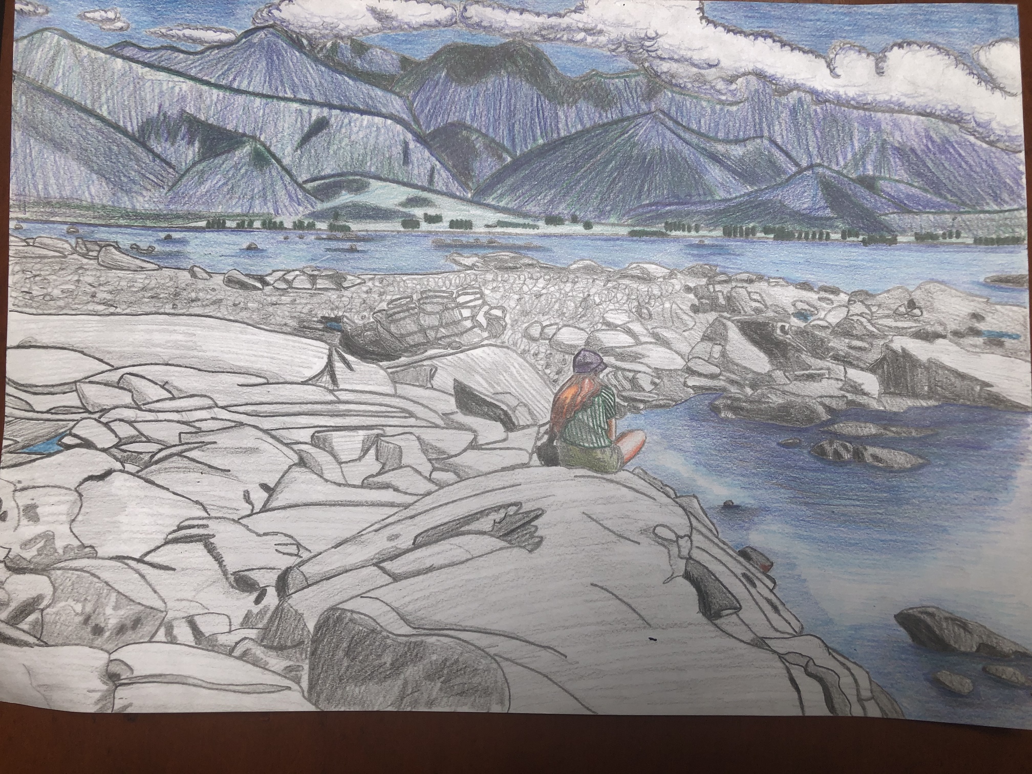
I think the main thing you can work on, even when working from photo reference is lighting. Highlight and shadow. The depth of your piece is pretty good, especially the water, though this is the one area I feel you can improve on the most.
Try to recognise the light source in the image. If it’s the sun, artificial light of some sort, etc. and how bright that light source is. The brighter it is, the smaller the shadows will obviously be, but they’ll obviously be more defined too. And of course, shadow falls where light dowsn’t touch. Shapes with sharp angles have edges to their shadows, whereas objects with curvature have gradients and blend the shadows together,
If you work on shading, then start building in the opposite - highlight, it’ll add even more depth to your work!
6 Likes
Wow thank you so much! That’s so helpful! Currently working crazy days so the art is on hold but when I get back into it I’ll be sure to consider my light source and shade accordingly! Thanks again!
5 Likes
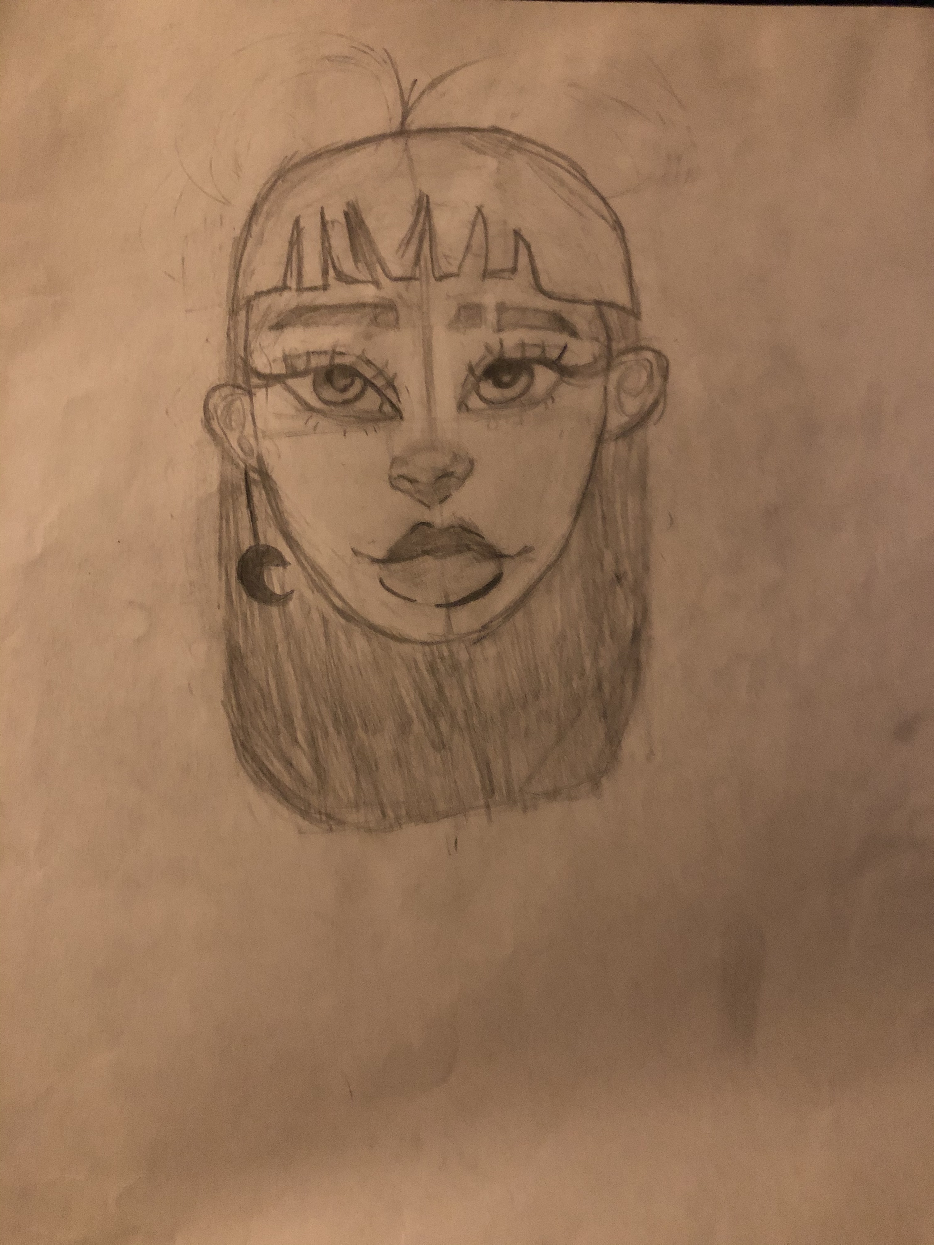
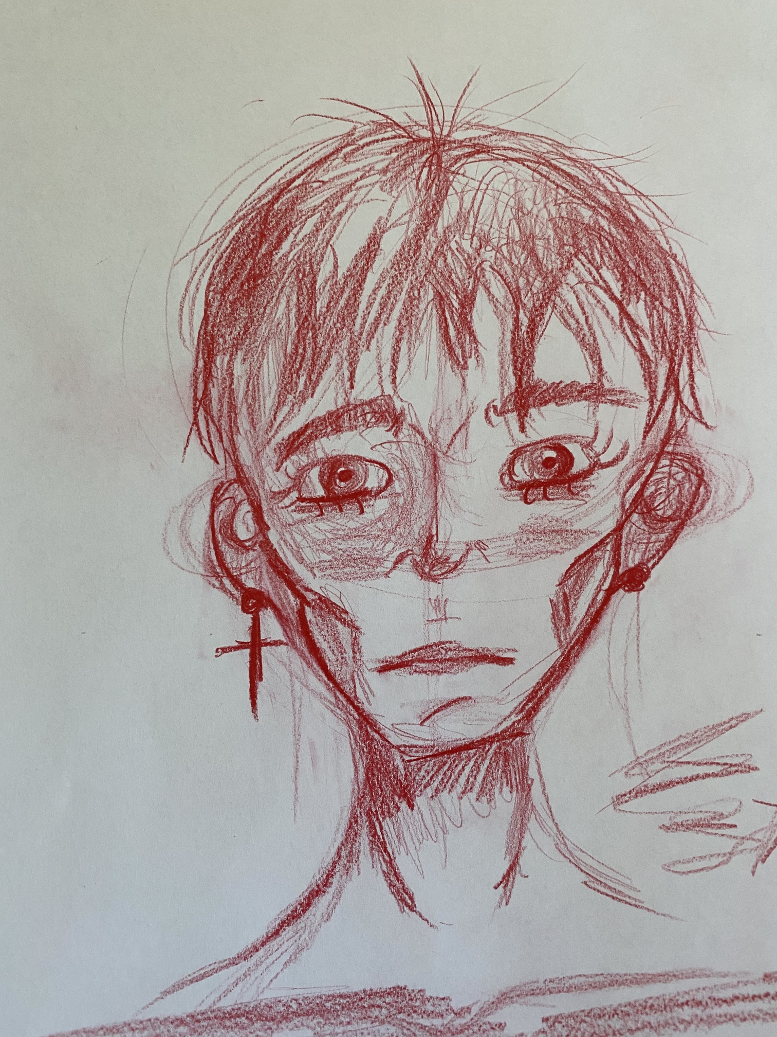
Love her eyes! Sorry, I’m not critiquing, just commenting.
4 Likes
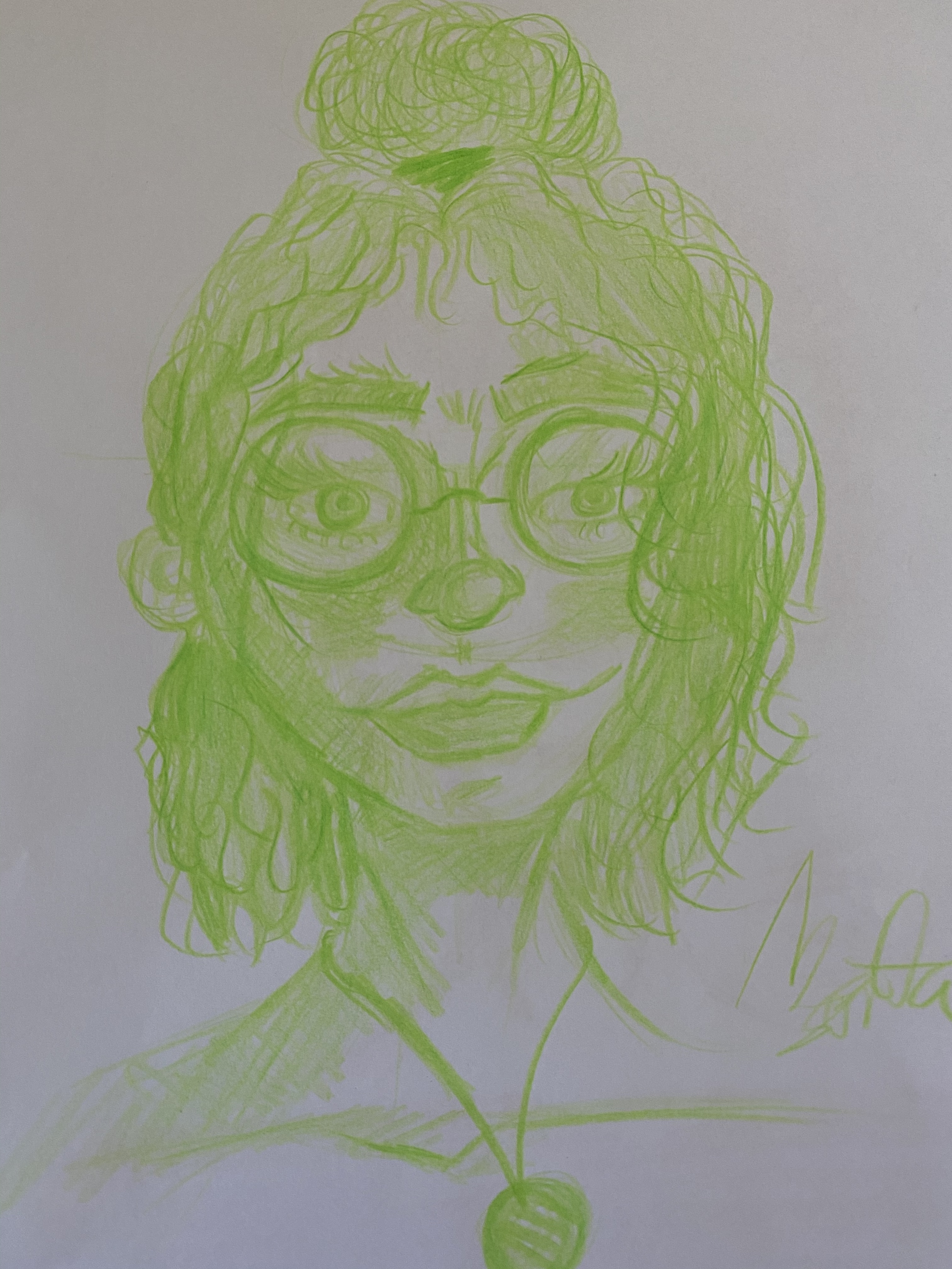
I can see you took a lot of stylistic flourishes with how the face looks! I think there are lot of excellent touches here, and it shows a lot of skill. The face proportions are very precise and the hairline works quite well. It was probably a stylistic choice, though the jawline could use a little work I feel. With how big the lips are the chin area looks a little odd. I love the likps, so the jawline is what I’d work on!
Of course, everyone knows what I always say. Improvement comes out of working from life and learning structure, anatomy and proportion. Once you have that down you can stretch it all out in interesting ways!
3 Likes
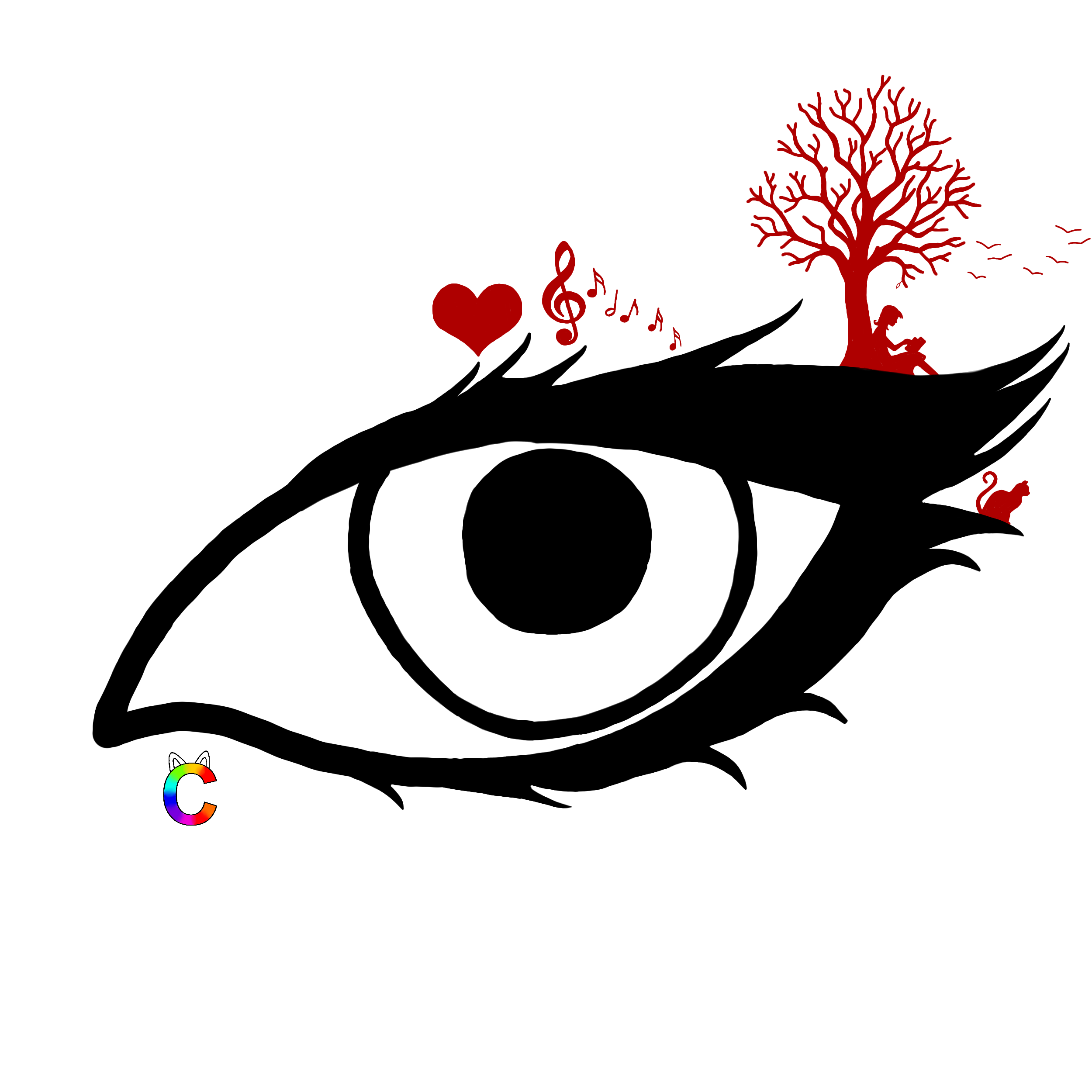
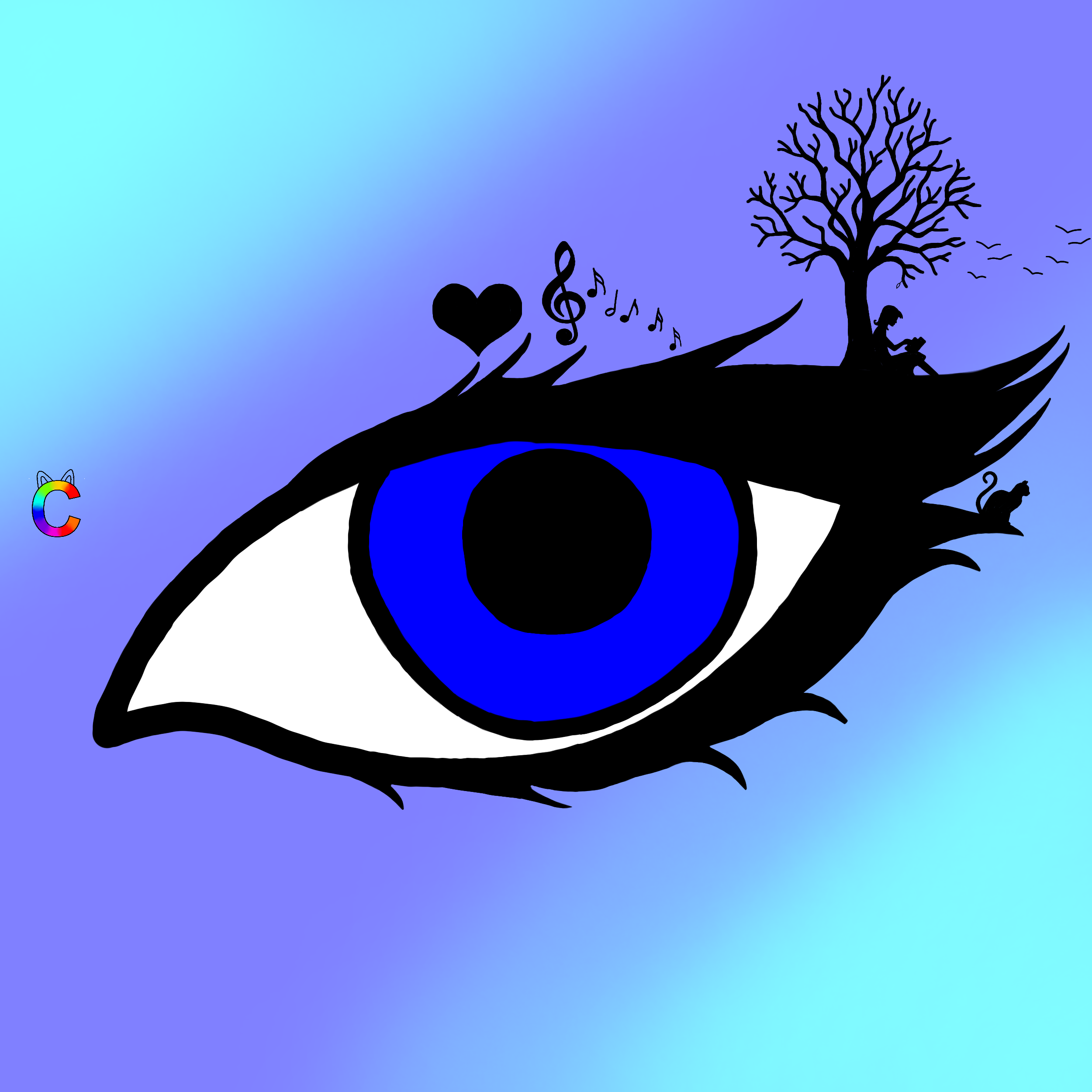
So I’ve posted this on the Share your Art thread already, but here it’s in better quality and another version ![]()
6 Likes
Yeah, I’m working on chins, and thank you for the feedback.
2 Likes
Thank you ![]()
2 Likes
Let me get back to you on this, Cat, this is nowhere close to my style (and it’s incredible) so it’ll take some time to formulate a proper critique ![]()
3 Likes
It’s fine, take your time ![]()
3 Likes
Alright, as you have asked for some constructive criticism, I will attempt to give you some. So I hope that it helps. I will just say that I do love this design and I can’t wait to see what else you have too, lovely. (wink)
Secret (hopefully helpful) advice for Rainbow:
- The framing and layout. White space in an image can be a good thing and the way you use it can really emphasise the message or meaning. Or even just symbolise what the image is.
For example, it’s the right eye of a face. So why not create the rest of the face with white space. So extend the white space on the left and bottom while keeping the eye on the right, between the top and middle third.
With the birds flying into frame, it’d be cool if their trail was stretched out a bit. Maybe doubling or tripling the space between the lash and the edge. Spreading out the bird trail, possibly to follow the line of the top lash, can help to draw the viewer’s eye down to the image. - Smooth lines. Some of the lines, like the pointed lashes and the inside corner of the eye, have beautiful edges. There are just some that aren’t the same. The outside line of the pupil, for one, isn’t the same thickness all the round. As well as a couple of the other edges and half of the lashes that have rounded points and not sharp points. I believe this is just the use of the paint tool over the pen one, so to fine-tune it, it only takes zooming in and playing with the brush size.
- Colouring. This is about the second image. Though I love the second image with the symbols in a black silhouette, having multiple blues without other colours is a little wish-washy and it’s when the image loses impact. Contrasting colours tend to work best for this and they help to make the image stand out.
- Logo. I love, love, love your rainbow cat ‘C’. It’s awesome and totally unique. The only thing I suggest is lowing the opacity and moving it over the image itself. Copyright symbols are used to not only show that’s someone’s work but also to stop people stealing for their own. Unfortunately, there are sneak people out there. So having it over a plain background makes it easier to steal and remove the ‘C’. Whereas, moving it over the eye/main image at a low opacity, may make it harder to show people but it makes it less likely that people with steal your work.
WOW! This was much longer than I planned. Sorry about that.
4 Likes
Thank you so much for all the advice ![]() I have a lot to work on now.
I have a lot to work on now.
I like the idea of extending the white space to create the face, I’ll try that out!
About the logo…I just nerver really cared about people stealing my stuff ![]() If someone thinks this is good enough to take it and show someone else, they can do it
If someone thinks this is good enough to take it and show someone else, they can do it
2 Likes
Let’s criticize my drawings! I’d love some opinions so I can get better in case I’d want to practice drawing more often!


5 Likes
Oh my-! I love how each character is so different. They’re sooo pretty, baby girl!
You’re totally welcome. I hope it wasn’t too much and I didn’t go overboard.
5 Likes