Thank you! That’s really nice of you! ![]()
But I’d love to hear what’s wrong with them, haha ![]()
Thank you! That’s really nice of you! ![]()
But I’d love to hear what’s wrong with them, haha ![]()
You’re welcome, baby girl.
Yeah, I get that. I would help but I don’t feel worthy too. I’m more helpful with digital design than drawing or illustration. So I think that @ChaoticDeluge would be able to help a lot more, though as it is his day off, he may not get to it until tomorrow.
Those characters are absolutely stunning, especially the last one! And I love the shading! ![]()
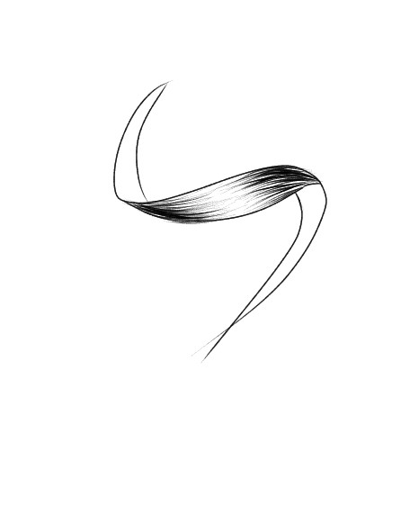
I think the main problem is the hair? Well, we can’t see hair in individual stands, but as blocks and pieces. So, i’d advise you to draw them in blocks, then sections, and the shade the hair, and then draw several strands, as details.
And if you want to shade hair you can do it like this:
At the both darker parts of the ends, you can flick your pencil towards the highlighted part but leave a gap.
You can observe how the hair goes using a reference photo to have a better understanding.
As for the heads, the third photo is slightly unbalanced? For example, the ear and the cheekbone of the left is lower than on the right. The chin is slightly slanted as well? I’d advise you to show your drawing to a mirror so you can identity any errors?
This is just my opinion, at the end of the day, what looks right to you is important!
Thank you! I’ll definitely keep that in mind!
I’m so happy people are using this more to give and receive wonderful critiques ![]()
I’ll get round to you all, I promise!
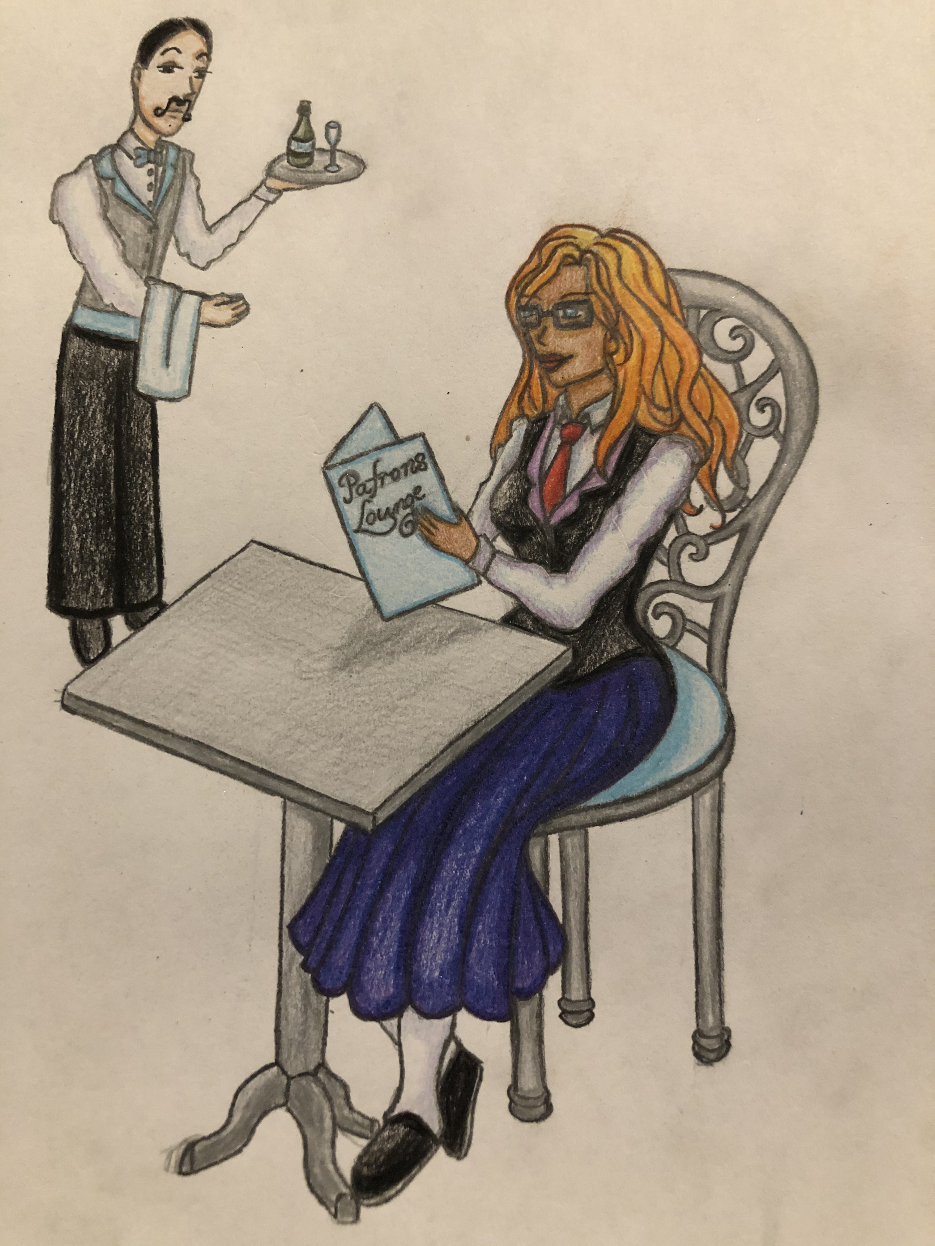
Here is a very very very rough idea for Patrons lounge. Do you think I should add a background? Does the snooty waiter add or detract?
I love the snooty waiter!
I’d say if you were to add a background, just having it be a nice, light watercolour wash or lightly done with pencils to imply background without washing it out, I adore the foreground a ton!
As for the waiter, I would have personally had him a little closer, though I love the Author taking prominence in the piece! It looks really awesome ![]()
Ohhh nice! ![]()
Since this is a rough draft I guess that you will make changes later on. What stands out to me is that the right leg looks a bit off.
I love the way you did her hair and the vest! ![]()
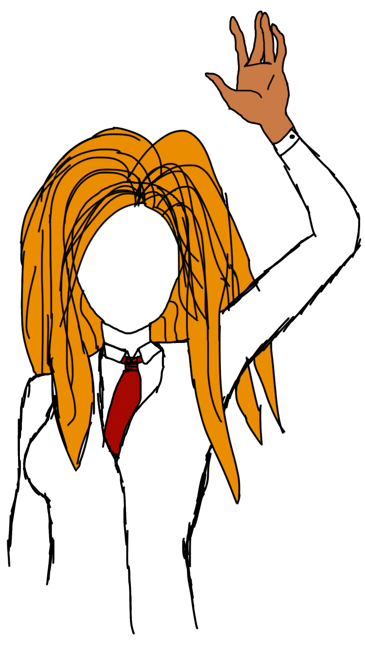
Though I’m not much of an artist, I thought I might as well try.
I’m still playing around with the face, and I’ve got a couple different designs for the hair, but I at least feel like I’m getting somewhere.
I still have to add some more details, and I’ll probably trace over the whole thing to clean up some lines, but I feel like it’s actually starting to look decent.
It’s definitely coming together! I’m a big fan of that hand ![]()
I think cleaning up the lines is probably the main thing for now, yeah. If you’d like a more in-depth critique with pointers on how to improve generally just let me know!
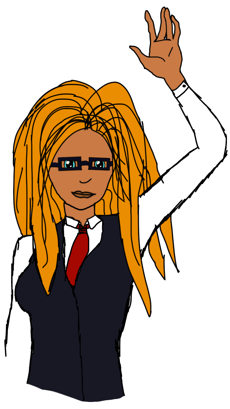
Hello! This is not the entry to the contest!
I thought it would be nice to draw a fanart of our wonderful Author. It’s her portrait and honestly, it was kinda hard. Is it good? No idea… although her glasses look like small TVs and her arms are… erm… interesting…
But I just had to try to draw her since I absolutely love the design!
Yeah the hand came out pretty nice. I’m not great with hands so I had to trace an outline, but it still turned out better than how it normally turns out for me.
I’ll take any critique I can get. Art isn’t my specialty so any feedback of what I should look to improve is very appreciated.
I love her ![]()
The Author is one of my favourite character designs of any that I’ve done! It makes me so happy that people are thinking the same thing! And seeing the different interpretations has put this huge smile on my face for days!
I’d say trying a lighter sketch before moving onto the final to iron out all the basics before moving onto detail would be a solid idea
Faces are very complex. They’re a real mess of planes and angles. It can take a lot of practice to get facial proportions down. There are a lot of tricks to doing it as well, I’ve posted some here in the past. Looking up the Lumis method is a good place to start!
And drawing from life to get more used to how bodies contort as they move and what different poses look like would be good as well ![]()
Oh my lord I need to come back to this!
I feel there are a few ways you can improve on this, but animals aren’t really my area! I’ll definitely get back to you though ![]()
those look awesome!
Since it’s a critique thread, I think the hair in the first picture looks a little bit weird and a lot less shaded than the rest of the face.
Okayy I’ll try to fix that next time! Shading guys’ hair is really hard for me to do aha idk why ![]()
![]() also ty
also ty ![]()
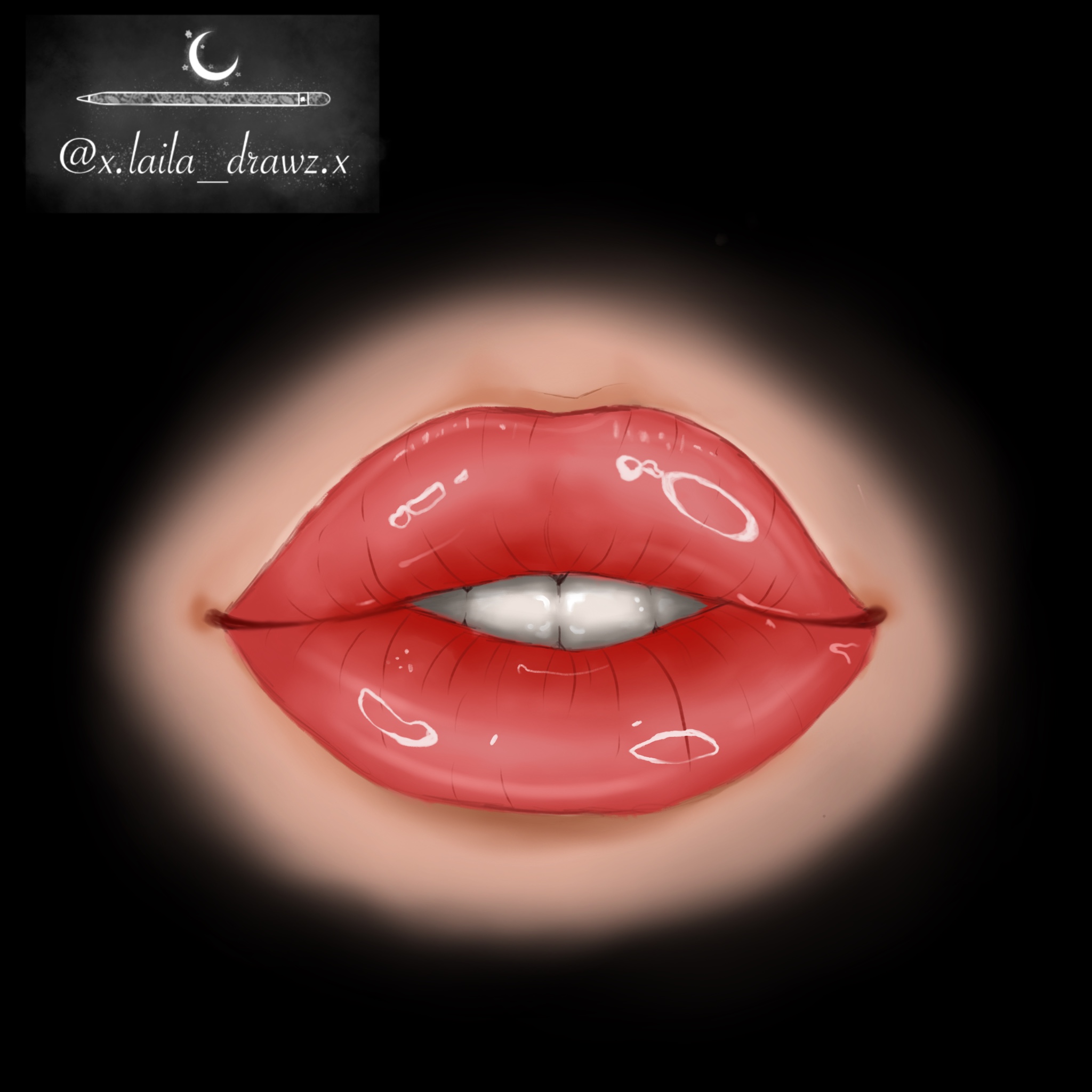
The lips are rad ![]() I’d say keep working at that interesting style with them I can’t say much because of how stylised the piece is. The first piece, I think I can say a little more about!
I’d say keep working at that interesting style with them I can’t say much because of how stylised the piece is. The first piece, I think I can say a little more about!
The facial anatomy is on point, I’m guessing there was reference?> It just kinda looked like it to me, hehe. Nothing wrong with that of course, it’s a fantastic way to gain those skills! I think my main question for this in terms of critique would be where is the light source? Why is the shading where it is? And once you figure that out, you could play around with it more to add more depth and contour, yeah? That would make for an interesting facial structure study!
thanks!! and yea it was with a reference haha it was my first time not tracing so it’s still a little rough around the edges lolll but yes i will make sure to focus more on that next time, ty!