Time to get into something a lot of people struggle with, setting up proper and good looking fc’s for there RPs. I will be honest, I don’t have that much experience specifically with setting these up, but in high school, I spent hours on presentations and I truly enjoy making these types of things.
What to include in the fc presentation?
On the first slide:
- Name of the RP
- Owner(s) of the RP
On character slides:
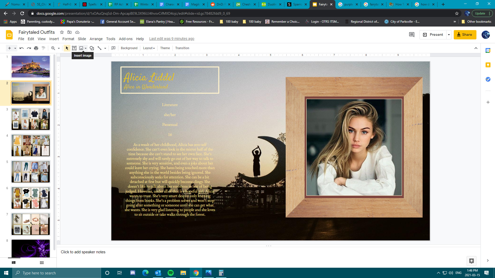
- Name of the character
- Image of the character
- Writer
- Age/sexuality/nationality if relevant
Biography and personality is a personal preference, some people like fc’s to just be actual fc, so username, name of the character and an image while others want every detail in there. There’s no good or bad about either of that.
How to NOT set up a fc presentation.
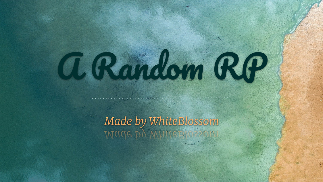
Okay, I must say, this is very very extreme but it showcases some of the things that people might be running into that could make them feel unsatisfied, some of the things I would change about it:
- Stick to a maximum of 2 different fonds.
- Keep the colors within one color pallet and look at which colors actually fit with each other, this website has a good explanation on that:
- Add in little headers, like if something is a bio, hobbies, ect., I’ve seen people forgetting that.
- Keep the layout of the page the same throughout the presentations, the only thing you could get away with is flipping the whole page every character.
- Add in more personality like a background or little quotes or just a little touch to make it feel like it are the fc’s of the actual RP, you have to see it as an extension of that. To show what your RP is about.
- People find it pleasant to look at a layout that has a mathematic approach, divide spaces equally and line things out with each other.
Can you think of anything else you would change about my presentation? Feel free to add it down below because I didn’t include everything to see if people would be able to to figure what it is.
Now to how to set it up specified for google presentations
I will do this showing step by step how to set up a way better face claim presentation
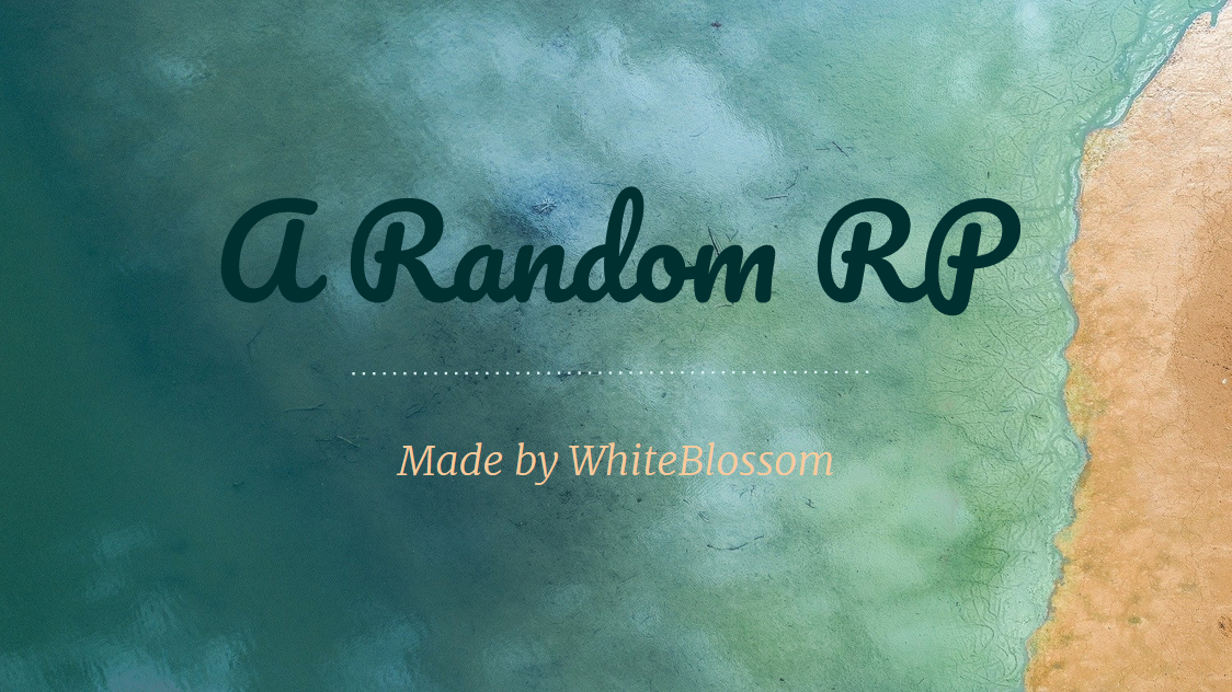
Step 1:
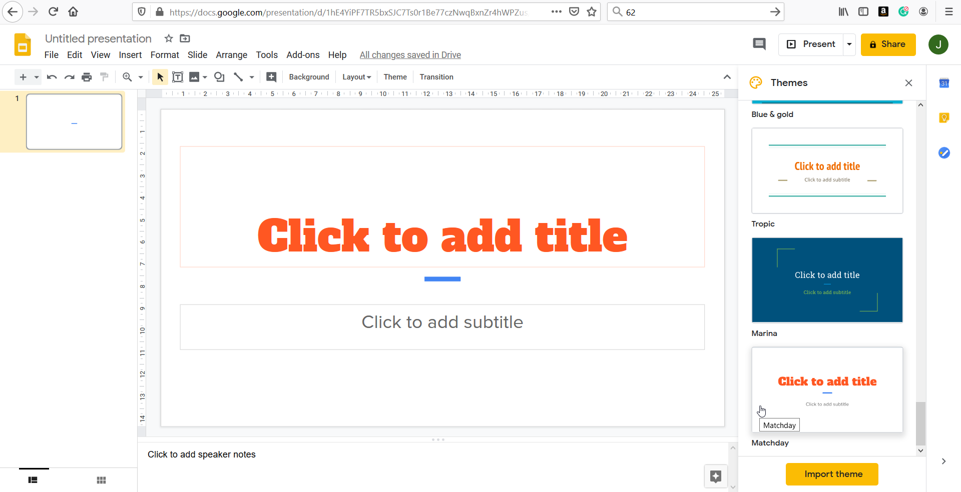
Choose an existing slightly more interesting theme, I chose this one. The reason I am doing this is that the layout from most of the themes already have some little touch to make them slightly more special.
Step 2:
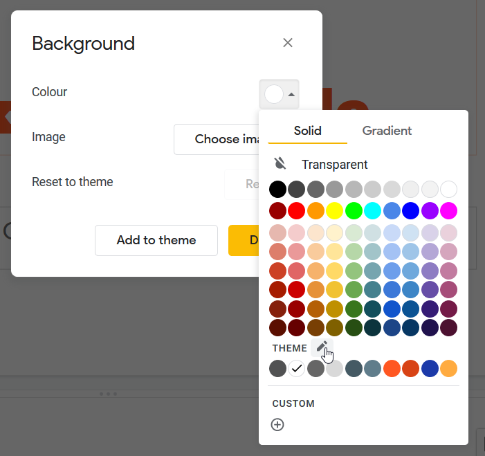
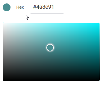
Change the colors into the ones you want, I will imagine for this presentation it has something to with characters living under the sea. If you push background and then the pencil you can edit the colors of your theme.
So, this are the colors I chose:
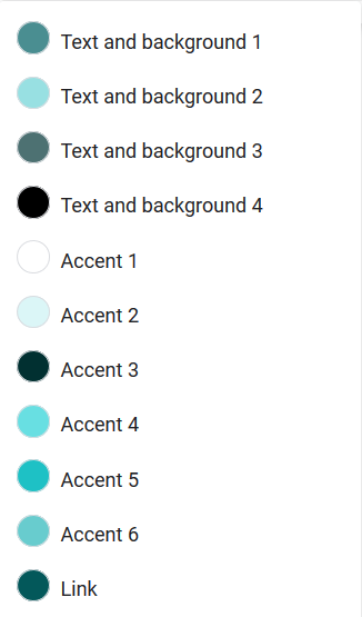
I kept them boring and all within the same color pallet:
I must say it’s already looking MUCH better now:

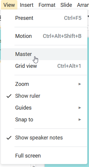
Step 3:
Work on the layout of your pages a little, and change the fonts. To save work, do it here. This place is the master page basically and you can change the theme exactly how you want it and that will be saved so you don’t have to redo everything for example.
I’ve simply changed all the fonts to the same one but it has 4 types, light, normal, bold and black and I played around with that a little bit.
Step 4:
Add personalized backgrounds using the background button when in the master section, I stumbled upon this picture and loved it so I will be using it.
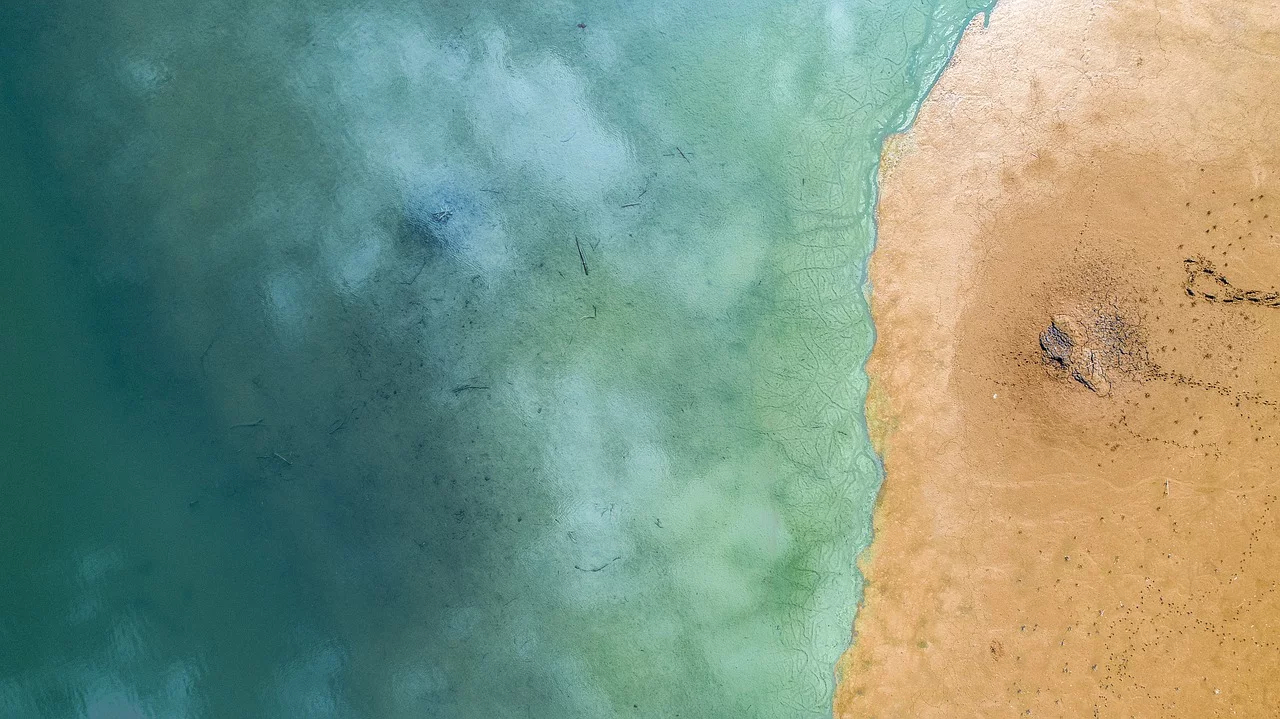
A website with a few links to sites where you can find free to use images, personally I would advise pixabay for backgrounds.
However, putting it in something looks off
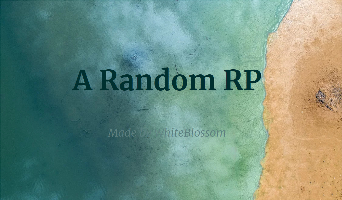
Yep, quick color changes, resizing the background, another font for the title (to make it slightly more interesting) and relocation of the text later this is what it looks like:
See how I included the color from the picture in there? And how I added the little extra touch with that line? Little things like this make it look a whole lot better, it’s important to connect think about what works with the background. This way it’s kinda 2 blocks of colors and 2 pallets which I will be using from now. Now one final thing and my first page is done, adding in some text effects (Format → format options) with this as a result
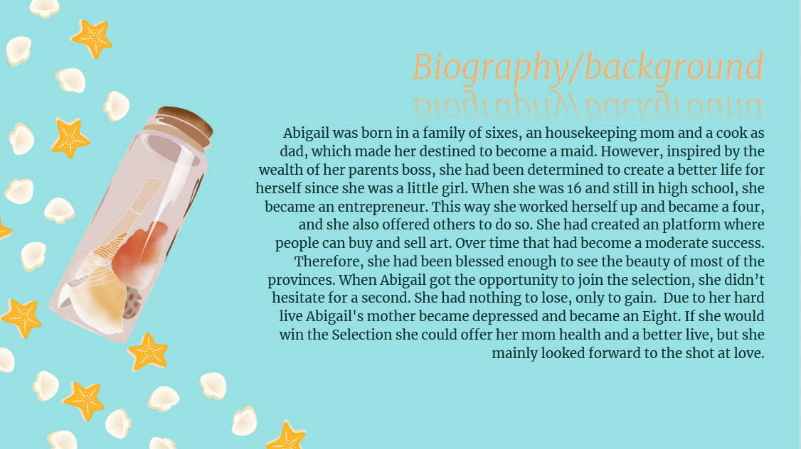
Okay, now this just all was in the first page of the presentation, now let’s add another character. I forgot to take screenshots so I will just drop the result so you guys can see what I did with it (yeah, lol, with this sea themed fc I used a character that is only used to snow ![]()
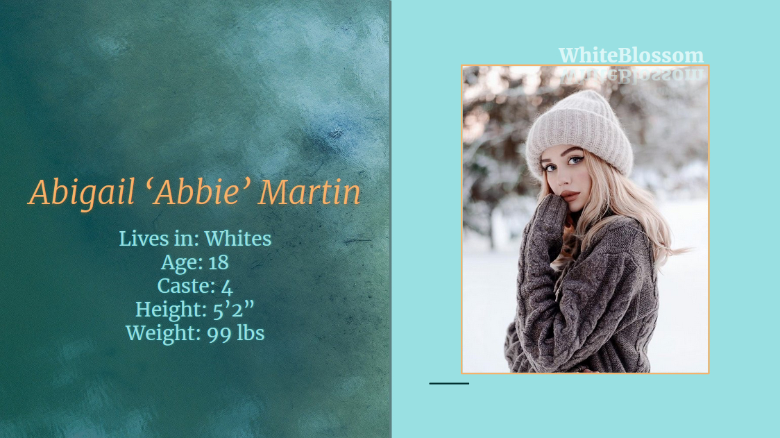
Some important things I did:
- I chose 2 different basic layouts, the one with the 2 colored blocks and just the plain one with a title and text, as you can see I changed one of the colors into the image.
- Added text effects, I chose for the reflection one because I feel like that fits the theme pretty well, just get a little creative with that and give it your unique touch
- Added a line around the fc image, just for the touch of color. And added a line between the blue background and the sea image, this is important to make it look more professional.
- Used a background color that is also present in the actual image I used, that way there is more connection between them.
- Center everything out, the text and fc image are in the middle of the middle and stuff like that, just makes it pleasant to look at, however, to be break it up a little bit and balance it out I added the username on the right side.
In case anyone finds the first sheet with the bio too boring I’ve made another one, I simply moved the text to the other side and added some PNGs I found on pngtree. This gives it a bit more playful look and that’s just a style preference.
Over here is the document if anyone wants to check it out.
I spend hours on this thread and the fcs, and I just wanna say that no, it is still far from perfect, with a few more hours I could make it even better and for example do more with the page with the background. I’ve almost given up 20 times, but with a whole lot of work everyone can get a perfect fc, it just depends on how determined you are to finish it. However, going back to this thread, instead of an actual explanation I feel like this has turned more into a tutorial on how I would make it but I hope I gave enough information along the way. Feel free to ask me any questions you might have, and sorry for this very long read.