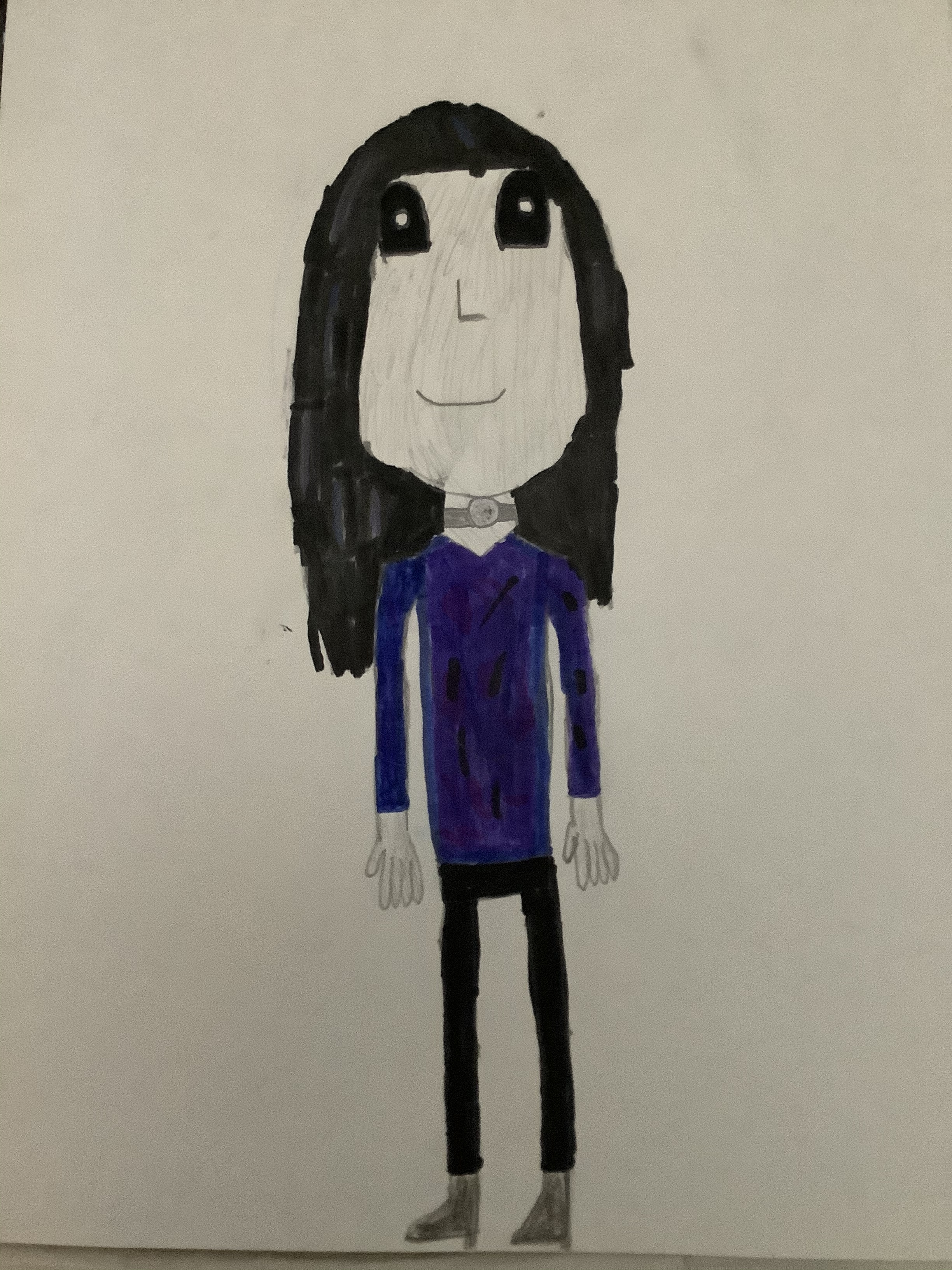
She has two left hands
…Oh my god. How many times have I done this, then? Crap.
Welp, I’ve done that with practically every character and I can’t change it because I colored them so I can’t erase. I’m not even where the drawings are. Oops. ![]()
I’m so annoyed at myself.
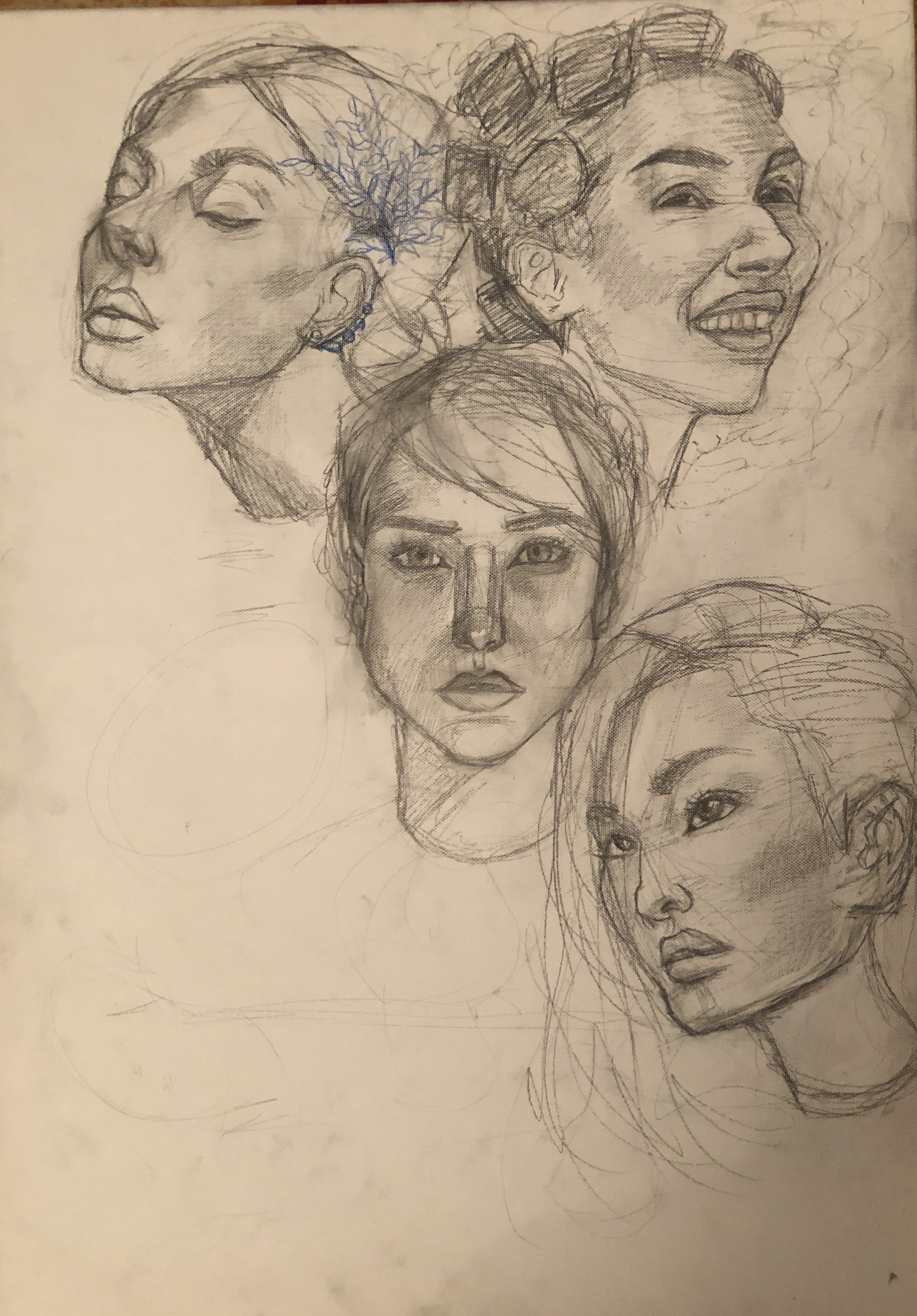
Ok, so my problem is that i feel like the girl in the top right corner might look out of place, since shes the only one smiling, or showing any emotion, really. Im not sure tho
Honorable mentions:
Yes, there will be another portrait in the bottom left corner, i didnt draw it in yet since maybe drawing it smiling would be a good option, so that the top right girl stops looking so out of place
Srry for how messy the sketch is
I know the shading is pointless if im going to paint over the sketch, i just did it because it was therapeutic
I did use refererences for all of them, tell me if u need them
I think having the bottom left face be smiling and have their gaze at least travelling to the right of the page would set the balance perfectly honestly.
You have a really solid anatomical mastery of the proportions of the human face, btw. And the overall tone and composition of the piece is pretty striking so far! Can’t wait to see more!
I would love them if possible. Also what do you shade with? And how do you draw faces so well? I am trying to do it but half my faces are horrible.
Here are 3 of the references: https://pin.it/2DYcMs3
A regular HB pencil
Thank you! Just practice! Use references, pay more attention to proportions, maybe note down what you feel is wrong with the way you draw faces now and try to improve on those specific things
Okay, @ChaoticDeluge, I am back with a new drawing. I tried drawing this using a reference photo from google. What do you think I could do/ improve on? :3
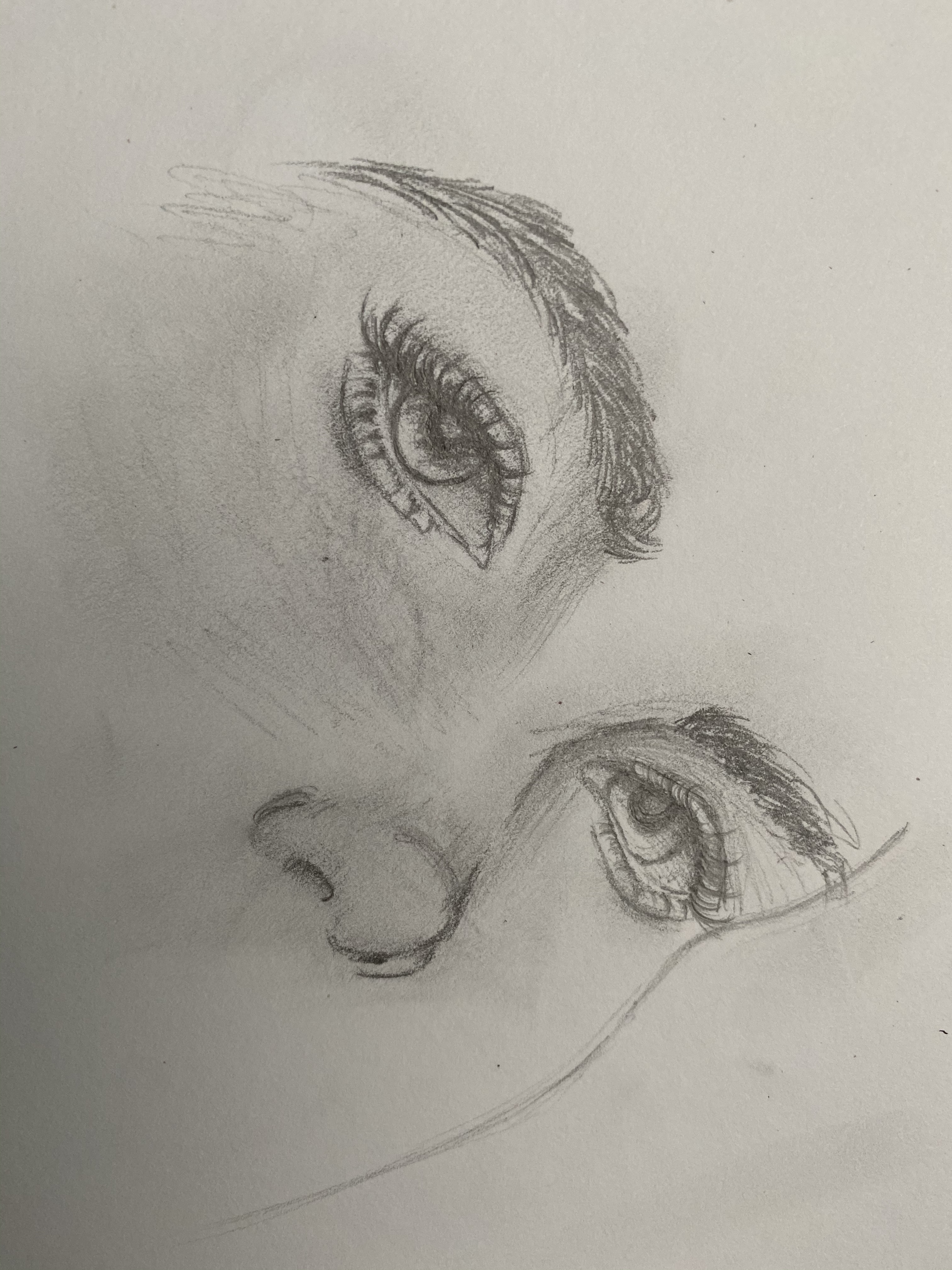
I don’t really know how to draw lips. Any tips? ![]()
Or noses^ I kinda suck at noses
@SugarDaddy69
- Try not to use white as highlight, use different hues.
- Add more shading to the neck, face, clothes, hair. Focus on the lighting and placement.
- Try not to use pure black lineart if it’s not a comic like style, or if the shading is mostly done with ink, or if the colors are bright. You seem to use pastel colors, so I recommend making some areas different colors that match their area.
@prashansaravi
- Try not to abuse airbrush, especially when the eyes were made mostly with a fine tip.
- Don’t be shy to make some areas dark to add volume.
- Give the nose more shading
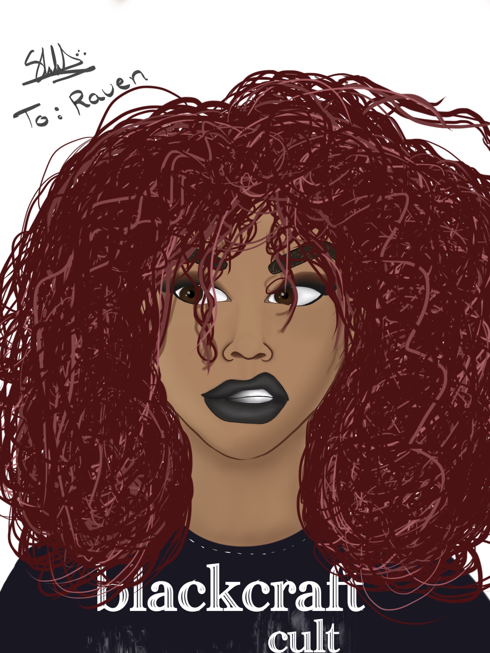
@WolfGamerGirl37
- Shade the hair, give it shading and lighting.
- Try making the colors match instead of clash, like the magenta lipstick isn’t working with the red and blue.
- Shade the skin, give it detail, give it volume.
- Give her eyes some light, she looks kinda soulless
- Avoid using the bucket tool.
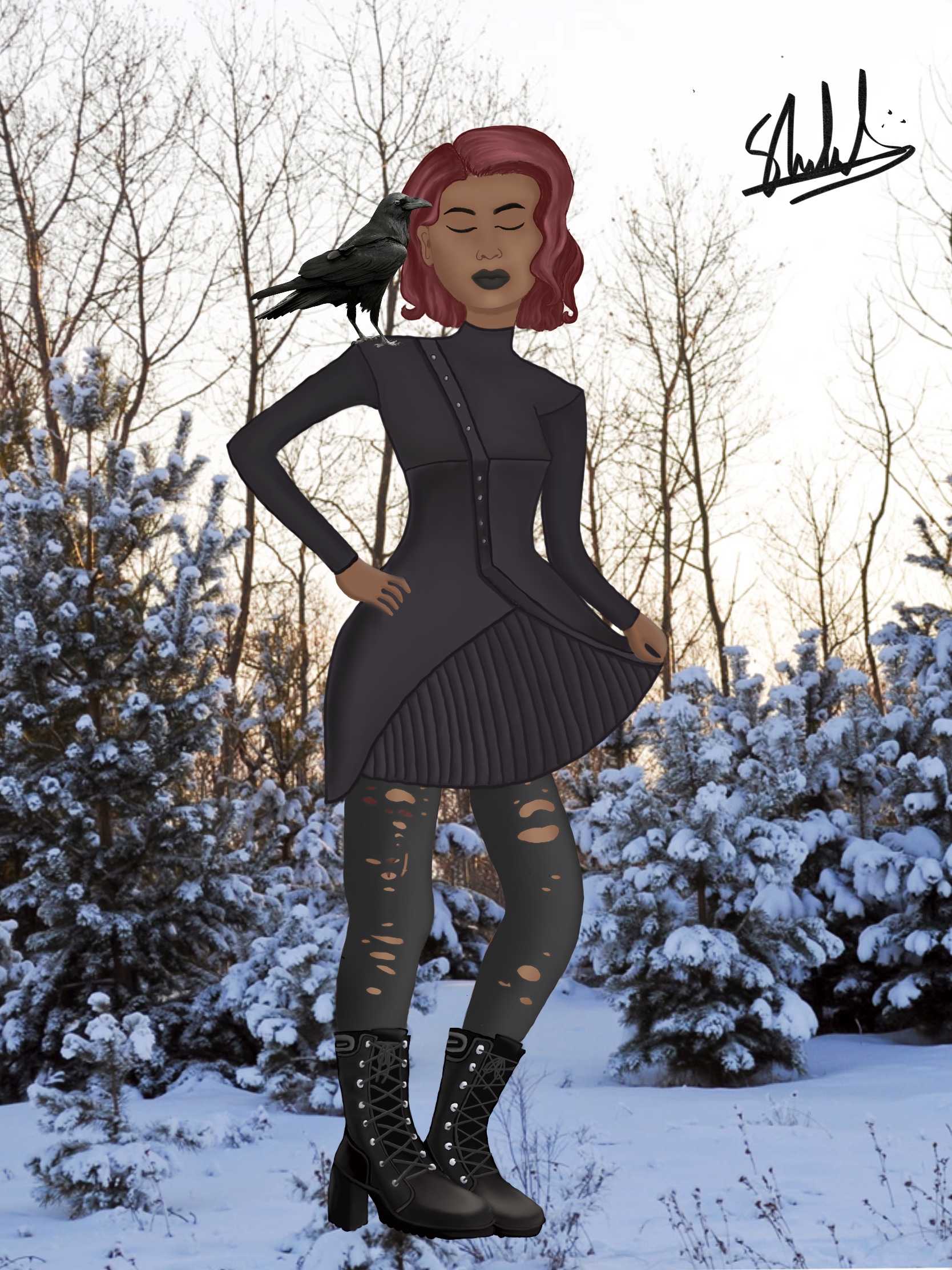
College Days -
- I don’t know what filter you used that makes the lineart look thick and messy, but please avoid using it, ESPECIALLY if you are using Limelight.
- Give them a lighting hue.
- blur the corners or something, or give it overlays like dust and light.
- Use a better font. The font does not match the theme you were going for.
@Vanilla
- The anatomy is odd. her breasts are facing another way than her chest, or they look stretched, and her butt is built weirdly.
- DON’T. ABUSE. AIRBRUSH.
- Give her eyes more light if looking soulless wasn’t your intention here.
- This is just my opinion, but if that’s supposed to be Saitama, then idk what happened to her outfit but some important parts are missing, her breasts and butt need to be covered like the original Saitama to avoid getting injured.
@Ouijaloveletters
- Try working on anatomy. I recommend looking at videos to help you structure the body better.
- Try different poses.
@Phoenixlynn.creates
- Work on anatomy more.
- Don’t abuse the Airbrush tool.
- Darken up some corners to add
 volume
@Danielle318
- Shade the hair, use various different sizes for the hair strands, remember, hair clumps up together.
- Study lighting and shading.
- AVOID USING BLACK TO SHADE.
- AVOID PURE BLACK LINEART IF THE COLORS AREN’T VERY BRIGHT OR THE LINEART ISN’T THE SHADING.
- Study and work on anatomy.
I didn’t use the bucket tool at all. I colored that in with the brush tool.
This was just me trying something new out but I probably won’t doing anything like this in the future anyway.
I have no idea how to add shade to this type of image. I never understood that part.
Another part, I’m not sure how to do it. Thanks for the tips though.
I was going for a certain look which I accomplished. I did not want the image to have the weird skin texture that limelight has. I will still use this filter because it looks good for what I was going with. I wanted it to look like a certain poster from the past. It doesn’t make it look messy at all. It gives the image more character then the actual style that limelight uses.
I forgot to add the light filter when I was working on this image.
You mean a vignette, right? I was going for a bright look which a vignette would have diminished the image if I did that.
This part I actually agree with you on. I do not like it now since it clashes with the image in general. Thank you for the advice in the long run though. It was helpful.
I wasn’t meaning for this to come off defensive. Sorry about that if it does come off that way.
In the second one, I think working on stable anatomy would be a big help. The character’s body looks sort of warped, which makes them look awkward.
The lipstick on the first one is a little too blurry. You’re getting there though!
Really? I don’t see it.
it looks like she’s hunched over a bit