Omg but Ravi! <3!!!
Girl leave him alone😭
Damn bro is inquisitive today
HAHHAHAHA
I’m not denying Ravi’s fc is stunning tooooo
New interaction
So many details I wanna get right ![]()
The contrast between my characters
It’s also so visible in their posts and the colours
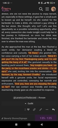
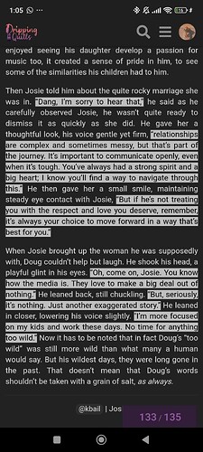
Doug: Black and white
Ravi: Red, orange and yellow
![]()
jus curious are u in light mode or dark mode
I can tell her dress is gorgeous but not too extravagant and not at all ridiculuous (not like Faust’s outfit at all)
Same as Rowan, he’d order a beer or a cocktail or a shot if it weren’t for trying to get Isabella to think before she drinks that vile drink she ordered
Aww, that’s so sweet!
Really? To me it looks grey and black (grey background and black text)
Also I L-O-V-E using a background color and text color for characters, I might need to switch back to that, I loved using it with Paris
Dark
But you made me try and see how it looks in light mode and my eyes are hurting now
lmaodnfkgkrh
Which mode are you in
And yes if you do it well using a background colour can just look fun and also make it readable across the different themes
This is how I meant it to look, like how I intended the colour vibes
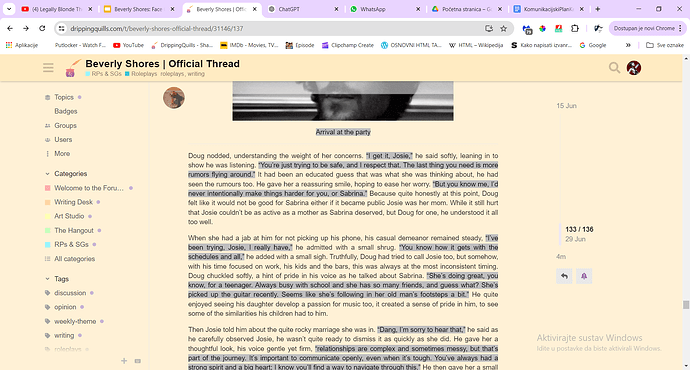
But quite interesting how I think in light mode especially Doug’s comes across so differently
How you’re describing it is so accurate to how I meant it. Like it’s extravagant but still very much genuine to her. Extravagant in the sense that I imagine her to carry the dress instead of the dress carrying her
Interesting for sure they have that sort of in common
She’s quite a sweet girl, but also very very confident. Like social anxiety doesn’t seem to exist for her and like it shows, she has absolutely no problem just approaching strangers ![]()
Pastel mode, I also couldn’t stand fully light mode, but dark mode hurts my eyes when there’s long paragraphy, I’ve actually had a power point presentation on it. Apparently when you have dark text on light background the dark text absorbs most of the light and it’s easy to read, but if you have light text on a dark background the light gets reflected in all directions and it’s much harder to read, so dark mode is not recommended for reading long texts, which on this forum I do almost every day so it’s not good for my eyesight, and the pastel isn’t exactly white so it looks better than regular white mode
I still prefer dark mode
But I use a filter that makes the white more yellowish so it’s much better for my eyes and easier to read
Doug’s just looks boring honestly in that
Actually tho Ravi’s lowkey works with the yellow background
